Steve's Progress with OCA

This blog is for the learning log for Steve Estill's progress in the study for the BA in Photography with OCA.

The first Module was Photography 1 - The Art Of Photography.
The second module was Photography 1 - Digital Photographic Practice - started in January 2012 and finished in May
For the third module see the new blog at http://moreocapnp.blogspot.co.uk/

Saturday, 19 November 2011

Assignment 4: Applying lighting techniques

The following 8 images are of the Young Buddha, taken in various types of light, to exhibit the following qualities:
  • Shape
  • Form
  • Texture
  • Colour
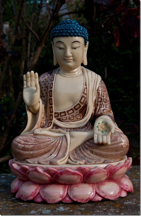
Meet the young Buddha:
assignment 4.01 form
Form 1
ISO 200, f/14, 1/160 sec
This first image, showing form, uses low early morning sun with light cloud.
This angle of light accentuates the folds in his garments and the contours on his hands and face, giving the impression of depth and 3D. I think this soft light complements his character.
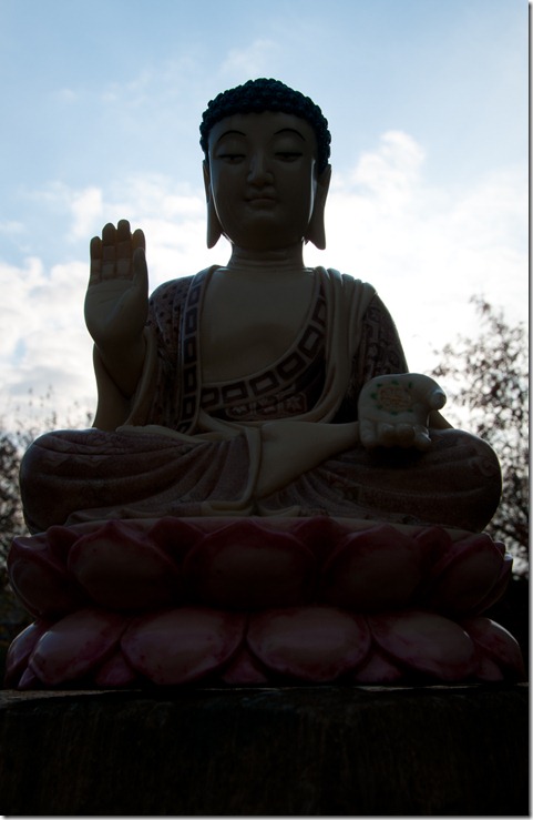
assignment 4.02 shape
Shape 1
ISO 200, f/32, 0.6 sec
A daylight lamp, fitted with a diffuser was placed behind Buddha and the image exposed for the light areas. This creates a silhouette which shows his outline shape.
assignment 4.03 shape
Shape 2
ISO 200, f/14, 1/320 sec
Early morning with the sun just over the horizon provided another opportunity to capture his shape. He is backlit by the rising sun, to obtain his silhouette. Some detail can be seen, but the overall impression is of his outline.
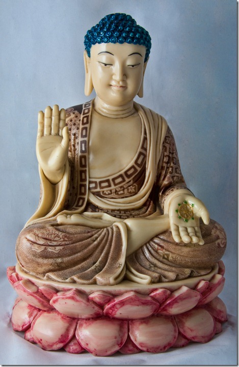
assignment 4.04 form
Form 2
ISO 200, f/29, 6 sec
Taken in a light tent with a daylight lamp directed onto the left side of the tent, the soft light enhances the detail and depth while maintaining the highlights. Using the matt black background has given the impression of the Buddha floating towards the viewer.
assignment 4.05 texture
Texture 1
ISO 200, f/29, 20 sec
With the diffused daylight lamp directed at an angle of 45 Deg to the upper rear of his body and set against a matt black cloth backdrop, the folds of his garment and contours in his face and hands are accentuated. The shiny texture of his face and hair are also exhibited.
assignment 4.06 colour
Colour 1
ISO 200, f/29, 2.5 sec
Using the light tent with a daylight lamp the colours are a true representation of those in the figure. This is due to the daylight lamp being used and the calibration of the camera, monitor and printer.
assignment 4.07 colour
Colour 2
ISO 200, f/14, 1/250 sec
Early morning light with a low sun provides this warm colour which really suits him. The clear blue sky complements this colouring. Side lighting also gives him depth and form.
assignment 4.08 shape n spot
Shape and Spot
ISO 200, f/32, 0.6 sec
Using the same arrangement as ‘Shape 1’ image but with a hand held LED torch plated onto his face, the impression of his shape is complemented by the light and calm in his face.

Exhibitions attended during this part:

'The Photographers' at Nunnington Hall, North Yorkshire

Monday 26 September 2011, 6-8pm
clip_image001

Jean Shrimpton at a Doll's Hospital, London, 1963 copyright Terry O Neill

You and your friends are cordially invited to the preview of Nunnington Hall’s next exhibition, The Photographers, on the evening of Monday 26th September 6-8pm.

The exhibition is a collaboration with Chris Beetles Fine Photographs and will feature photographs by some of the country’s most important and renowned photographers including David Bailey, Sir Cecil Beaton, Bill Brandt, Terence Donovan, Patrick Lichfield, Cornel Lucas, Roger Mayne, Terry O’Neill, Norman Parkinson Martin Parr, Edwin Smith and Snowdon.
In addition, we will be showing work by masters of the medium from around the world, including Eve Arnold, Elliot Erwitt, Horst P Horst and Andre Kertész.
The show will be a visual delight, mixing portraiture, landscape, reportage and fashion – the four cornerstones of photographic history. You can get a preview of the show by looking at the website:
www.chrisbeetlesfinephotographs.com/exhibitions.html

The opening of this exhibition will be an opportunity to see and buy some of the best photography that the gallery have exhibited in London, as well as a chance to enjoy the surrounds of one of the country’s finest houses.
Both Chris Beetles and Giles Huxley-Parlour will be present on the night. Please RSVP to linzi.caton@nationaltrust.org.uk or telephone 01439 748283
We look forward to seeing you on the evening.
The full address is:
Nunnington Hall
Nunnington
Near York
North Yorkshire
YO62 5UY
01439 748 283

Exhibitions 5

THE PHOTOGRAPHERS AT NUNNINGTON HALL | Chris Beetles Fine Photographs

Pages 1 of 8 – All pages are with the learning log hard copy package

An excellent exhibition!

Further research into Light

I was advised to look at the work of the following Photographers in relation to their different approaches to light:

Bill Brandt

Ansel Adams

Wolfgang Tillmans

Bill Brandt:

I was lucky enough to see some of Bill Brandt’s work in an exhibition at Nunnington Hall, where we were invited to the preview evening on 26th September. Other photographers included: Antony Armstrong Jones, Eve Arnold, David Bailey, Sir Cecil Beaton, Terence Donovan, Terry o’ Neil and several other world class photographers. I’m afraid the prices for prints were way out of my pocket, but it was never the less a real treat to see.

One of his favourites was ‘Top Withens’ on the Yorkshire Dales – a man after my own heart. In this image he waited until the conditions were right to get the image he wanted to portray. This was typical of the way he captured landscapes, waiting for the conditions and light to be right for the image he wanted to catch.

His later work seems to make ‘light’ the dominant part of his images. High contrast images accentuate this use of strong light, whether nudes, portraits or landscapes. The common theme was to use light to show the subject at its best.

This statement he made is one I really appreciate:

I am not interested in rules and conventions ... photography is not a sport. If I think a picture will look better brilliantly lit, I use lights, or even flash. It is the result that counts, no matter how it was achieved. I find the darkroom work most important, as I can finish the composition of a picture only under the enlarger. I do not understand why this is supposed to interfere with the truth. Photographers should follow their own judgment, and not the fads and dictates of others.”

I also appreciate his attitude to the darkroom – this has always been the best part and most interesting for me. So much can be altered and enhanced here. I too believe that an image should be an interpretation of what the photographer wants it to be – not just a factual record of ‘this is what it looked like’.

Ansel Adams:

He had a similar outlook to Brandt with regard to manipulation in the darkroom, particularly using dodging and burning to alter the tonality of an image. He wanted to create, as opposed to record.

His use of light, especially in his Yosemite images is more to use the existing light to create a spectacular view. His photographs were predominantly high contrast images which showed off the light - this is in contrast to Bill Brandt who used light to produce the feeling he wanted to represent in an image.

He appreciated the changing nature of light and its effects on the landscape and developed a zoning system for the different qualities of light for use in composing an image. In this system, he took light measurements of the significant areas in a scene – these were correlated with exposure and developing criteria to determine the whole range of tones which would be seen in the final print, taking the guesswork out of the photography.

Wolfgang Tillmans:

Looking at his work, I find it hard to determine a common thread regarding his use of light with his photography. His exhibitions tend to be more themed to the use of light, with large expanses of white with sometimes small unmounted, unframed images. At other times his images are huge, to make an impact. Some of his images, particularly his ‘lighter series’ where he uses glossy paper show a skill in directing and using light to produce abstract photographs, but other photographs used seem to be almost in the vein of ‘family snaps’.

So I’m afraid I have very mixed emotions regarding his photography – he obviously has a lot of skill with some types of image, using overcast light or backlighting to show texture in his still life photographs, but then I think he spoils it by taking an image to shock which exhibits no particularly good photographic skills. Obviously beauty is in the eye of the beholder and some I appreciate, but if fame is to be gained by using average photographs of body parts to be provocative in the name of art then I’ll remain anonymous.

I’ve used various books / websites in the study of colour. Of particular note are:

The Focal Encyclopedia of Photography – 4th Edition – Michael R. Peres

ISBN 13: 978-0-240-80740-9

Light Science & Magic – 3rd Edition – Hunter / Biver / Fuqua

ISBN 13: 978-0-240-80819-2

The History of Photography – Beaumont Newhall

ISBN 0-87070-380-3

The Complete Guide to Light & Lighting in Digital Photography – Michael Freeman

ISBN 13: 978-1-904705-88-8

Web Pages

www.billbrandt.com – a huge resource for his life history and photography

http://www.vam.ac.uk/people/b/bill-brandt/ - The V&A museum photography section for Bill Brandt

http://www.anseladams.com/ - the Ansel Adams Gallery.

http://masters-of-photography.com/ - a good site for overviews / biographies of the masters.

http://tillmans.co.uk/ - A good resource for the work and exhibitions of Wolfgang Tillmans, including pdf downloads of exhibition catalogues.

http://www.royalacademy.org.uk/events/talks/wolfgang-tillmans,1554,EV.html – Royal Academy Schools Annual Lecture by Wolfgang Tillmans

Exercise 4.13 – Shiny surfaces

For this exercise I’ve used a stainless steel cake slice. I used the 10-20 mm lens, set at 20 mm, to enable a low height on the tripod while maintaining a good depth of field. The camera remains in the same position for each image, in aperture priority and using minimum aperture.

exercise 4.13.01 baseline

Baseline

This image was taken with the light positioned next to the camera at a height of approx. 0.5m. The backcloth is shown as completely black while the camera obscures most of the blade, due to the exposure for the bright light area. The reflected light has caused bad burn out in the image.

exercise 4.13.02 directly above 0.5m

Tracing paper cone with light 0.5 m directly above

The light is in the same position, but the set was covered with a cone made from tracing paper with the camera lens protruding through its apex. All light is now outside the conical tent. This has reduced the glare from the light and allowed a longer exposure resulting in this image which shows much more of the knife and some detail in the backcloth. The reflection of the camera lens is still too evident.

exercise 4.13.03 directly above 1 m

Tracing paper cone with light 1 m directly above

With less light playing on the cone the exposure time is extended, allowing more detail again. The image is slightly lighter, allowing more detail throughout (including the lens reflection).

exercise 4.13.04 to right 1m

Tracing paper cone with light 1 m to the right

The light reflected onto the lens is slightly less, but still most annoying.

exercise 4.13.05 tilted to right 0.5 m

Blade tilted with tracing paper cone with light 0.5 m to the right.

The blade has been tilted forward so that the lens is not reflected in it. The light is coming from the right hand side. Although the lens is not now showing, the reflection of the side lit tracing paper detracts from the image.

exercise 4.13.06 tilted above 0.5 m

Blade tilted with tracing paper cone with light 0.5 m directly above

With the blade tilted, the light is moved to next to the camera at 0.5 m. The brightness and directness of this light has produced a flat looking image. The blade looks as though it’s made of paper.

exercise 4.13.07 tilted above 1 m

Blade tilted with tracing paper cone with light 1 m directly above

Slightly more detail, but mainly in the reflected paper.

exercise 4.13.08 tilted lower right 0.5 m

Blade tilted with tracing paper cone with light 0.5 m to the right

Light is still reflected on the blade, but to a lesser degree. The handle is now shining brighter than the blade and we can see more texture in the backcloth. This is the most satisfactory image, but not one I’d be pleased with.

We’ve seen that varying the angle of light and the distance it is held have an impact on this type of image. I feel that the size of the cone was very restricting in this exercise. It meant that very little difference was made when the light was moved, so the positioning of the blade to find a better view was also restricted. Personally I would try to find an angle where the reflection on the blade is more pleasing – definitely not taken from directly above, and I’d use my light tent, which allows a great deal more flexibility with lighting and better access to the set.

Thursday, 17 November 2011

Exercise 4.12 – Contrast and shadow fill

Using a coffee set for the still life, placed on and in front of green mountboard, various reflectors were used to see the difference in contrast and the effects of shadow fill. The seven suggested reflectors were used and then taken further with another four modes.

The first seven were placed in the order of highest contrast to lowest, as follows:

The light was placed approximately 1 metre from and at the same level as the coffee set and positioned to shine at an angle of 90 Deg to the direction of the camera line of sight. The camera was in aperture priority and tripod mounted. No other light was present in the room, the window blind and curtains were drawn and the door was closed.

exercise 4.12.01 No diff

No diffuser or reflector.

The daylight lamp being used did not have the diffuser fitted. No reflectors were used.

This setup produced the hardest light with the highest contrast. Shadows are deep and there’s not much detail in the china.

exercise 4.12.02 diff

Diffuser – no reflector

With the diffuser fitted to the lamp the image has become softer. More of the detail is showing compared to the first image and the contrast has decreased.

exercise 4.12.03 white board 1

White Board reflector 1 m

A piece of A1 Ice White mountboard was held 1 metre to the left of the set, opposite the diffused lamp. Light is now reflected from the board and ‘fills’ the shadow areas in the set. More detail is seen than in the previous images, but the contrast is further reduced. The set is becoming lighter.

exercise 4.12.04 foil dull

Foil reflector – dull side

Kitchen foil is placed in front of the mountboard with its dull side facing the set. The overall brightness has increased yet again with a better fill effect. Details in the shadows have improved, but there’s a slight loss in contrast. The reflected light line on the crockery seems brighter and narrower than that of the card – I can only assume that there’s a slight convex curve on the foil.

exercise 4.12.05 white board 0.5

White Board reflector 0.5 m

The white mountboard is positioned 0.5 metre from the set. There is now less light loss due to distance, both from the lamp to the reflector and from the reflector to the set, so the set becomes brighter again. The shadows reduce as they are ‘filled’ with light and more detail is seen throughout the set, while the contrast decreases

exercise 4.12.06 foil bright

Foil reflector – bright side

The foil was reversed so that the shiny side faced the set. This has further increased the shadow fill and reduced the contrast.

exercise 4.12.07 foil crumpled

Foil Crumpled

The foil was crumpled and straightened again, then positioned with the crumpled shiny side facing the set. This has increased the reflected light further. It’s not the effect I expected, but this may be due to having more faces reflecting light towards the set. Whatever the reason, the set has become less contrasty and generally lighter. The reflected light patterns are interesting.

exercise 4.12.08 black bd diff

Black Mountboard Reflector – Diffused Lamp

Now experimenting to see the effect of black mountboard, the contrast has increased beyond that of the first image.

exercise 4.12.09 black bd no diff

Black Mountboard Reflector – No diffuser

Removing the diffuser, the shadows are now harsher and contrast has increased still further.

exercise 4.12.10 black cloth no diff

Black Cloth reflector – No diffuser

Using a matt black, cloth reflector the dark areas have become even darker. Contrast has further increased.

exercise 4.12.11 black bd no diff refl flash

Black Mountboard Reflector – Reflected Flash

For this image I replaced the lamp with a digital flash lamp, mounted on a mini tripod and facing away from the set onto a reflector made from the crumpled foil – the set was then lit by the reflected light from the flash. The flash was triggered using a radio control from the camera. The shadows in the image are now completely black and the white areas have some burn out. I don’t think I can increase the contrast any further for this set. I like the effects on the red areas in this image.

So we have seen that the positioning of the reflector has an impact on the amount of light reflected – the closer the reflector, the lighter the set. We have also seen that the brightness and lightness of the reflector also has an impact on the amount of light reflected – the brighter the reflector, the more the light is reflected.

We have also seen that the more the light is reflected the more shadow fill is gained and the contrast reduced.

Experimenting further, the next image uses two lights:

I made a snood to fit the daylight lamp, using white card covered by matt black fabric which was taped to the daylight lamp and pointed it to the adult sheep (Fluff and Truff)

The young sheep (Truffson and Fluffette) were lit by a hand held LED spot lamp.

exercise 4.12.12 two lights

Setting out

I used a black polyester dressing gown for the set and used a large aperture (f/3.5) so that the parents were out of focus (as we generally are where the offspring are concerned).

I think the two different lights work well here as the youngsters are much ‘whiter and brighter’ than the ancients who we’d expect to be going a bit off white. The dark space between the two couples works to effectively separate the two distinct areas.

This has been another very interesting and enlightening exercise.

Wednesday, 16 November 2011

Exercise 4.11 – The lighting angle

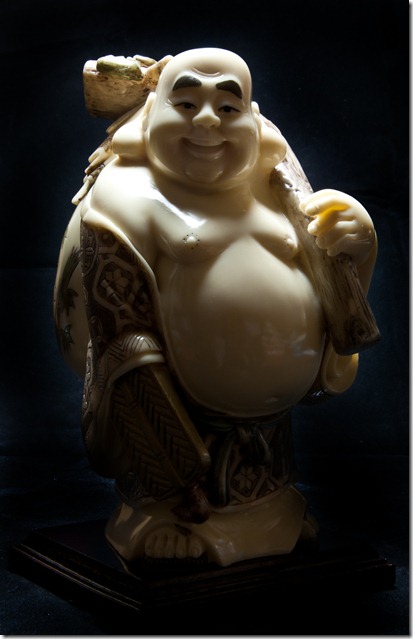
For this exercise I chose the Walking Buddha as the model. I used a matt black background to create a good contrast with the images.

I again used the daylight lamp with the white background for the light tent covering the lamp shade (shade already white and a cool temperature lamp) as a softener. This works well as the lamp head is on a flexible stand which allows easy positioning. The blinds and curtains were drawn in the study with the door closed, so all light was from the daylight lamp.

exercise 4.11.01 front

1.  Frontal Light

Lamp at camera height, pointing straight at Buddha

This full frontal light tends to flatten his features. His high cheeks and wide mouth can’t be distinguished easily.

exercise 4.11.02 side

2. Side Lighting

Lamp at camera height, pointing to the side of Buddha

This angle gives better relief and he’s definitely looking happier, but his left hand side is lost too much for my liking.

exercise 4.11.03 side rear

3.  Side Rear Lighting

Lamp at camera height, pointing to the rear side of Buddha

He’s still got his smile, but the contrast between the light and dark sides is too much for me.

exercise 4.11.04 rear

4.  Back Lighting

Lamp at camera height, pointing to the rear of Buddha

As a silhouette it’s fine, but so much detail is missing from his image that it just doesn’t work for me.

exercise 4.11.05 front high

5.  High frontal lighting

Lamp pointing down at 45 Deg, straight at Buddha

This angle has produced lots of detail and form. But he still looks a little ‘flat’ around the eyes.

exercise 4.11.06 side high

6.  High Side Lighting

Lamp pointing down at 45 Deg, to the side of Buddha

He’s now getting more form without losing too much of his left hand side. His cheeks and mouth are really showing his smile here and there are contours around his eyes.

exercise 4.11.07 side rear high

7.  High Rear Side lighting

Lamp pointing down at 45 Deg, to the rear side of Buddha

This angle shows more depth – his sack is now more evident and he looks as though he’s moving from the light.

exercise 4.11.08 rear high

8.  High Back lighting

Lamp pointing down at 45 Deg, to the rear of Buddha

This lighting position produces a lighter area to his front as well as giving him depth, but I feel it that there’s still not enough front lighting – may be a case for some fill light. The eye is distracted by the light on his fingers.

exercise 4.11.09 overhead

9.  Overhead lighting

Lamp suspended directly over Buddha

This light is complimentary for his upper body, but his feet disappear in the shadows (I know just how he feels!)

exercise 4.11.10 overhead back

10.  Overhead Back lighting

Lamp suspended just behind Buddha

I like the texture exhibited in this image. He’s got a wonderful smile. There’s still too much light on his left hand, and detail lost around his feet, but the rest looks very good.

exercise 4.11.11 overhead front

11. Overhead Front lighting

Lamp suspended just in front of Buddha

This lighting is a little too far forward. We’re seeing the front lighting better, but the top of his head and face are now becoming a little ‘flat’

I think the lighting that suits this subject best is No. 7 – ‘High Rear Side’. This gives more form while retaining the happiness of the figure – enough light to show his features and sufficient contrast to show the depth of the man, his goods and his clothing. An altogether happy state to be in!

I think that No. 8 could surpass No. 7 with the use of selective front fill.

This has been a good exercise to experiment with the positioning of the light. Obviously the different positions affect the way the model is portrayed and what aspects are exaggerated / repressed.

Exercise 4.10 – Softening the light

For this exercise I’ve borrowed my wife’s daylight lamp and used it in conjunction with a light tent.

exercise 4.10.1 side daylight

Side Light – bare lamp

This image was taken with the light tent folded back and the daylight lamp shining from the Left. No other lights were on in the room and the curtains were closed.

ISO 200, f/29, 1.3 sec

The shadows created by this light don’t help this image.

exercise 4.10.2 side daylight softened

Side Light – softened

With the light tent erected, the daylight lamp is now softened by the fabric of the tent.

ISO 200, f/29, 4 sec

The harsh shadows have disappeared and the entire image feels softer.

The first image has much more contrast which brings out highlights in the eyes, but the shadows are too hard and cause too much distraction in the background. The second image has lost the hard shadows and so lots of distraction. The sparkle has gone from the eyes and some of the depth has been lost, but there’s a lot more detail to be seen and the girls have become much softer and inviting. Could you fall for a Friesian?

So for this image I think the soft light works better, but this is not a general rule. Each image needs to be judged on its merits and lighting used appropriate to the required outcome.

Project – Photographic lighting

Exercise 4.09 – Outdoors at night

The first set of night images were taken in Durham on a Saturday evening while returning home – not recommended if you’re worried about gangs of youths and lots of drunks. To make things easier it had turned very wet, which I tried to turn to my advantage.
exercise 4.09.01 Cathedral

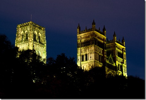
Durham Cathedral from the embankment

Taken from the far side of the river in almost total darkness, this image was taken at ISO 100, f/14 with 30 sec exposure. The light levels on the cathedral were quite low, so the extended exposure was used to enhance it.

exercise 4.09.02 Old Milburngate

Old Milburngate Bridge

The bridge is lit up by very yellow lights. This was from a vantage point further down the river, again taken at ISO 100, at f/3.8 and 2 sec. I wasn’t concerned with the depth of field as I was a good distance from the bridge anyway. The yellow light has been toned down, using selective colours in Photoshop.

exercise 4.09.03 Under the arches

Underneath the Arches

Another view of Old Milburngate Bridge – this time taken towards the floodlights from the dark side of the bridge. ISO 100, f/13 and 30 sec exposure. I wanted to capture the line from the handrails and detail in the stone, from the dark side of the bridge. This was my last image from this area – it wasn’t pleasant and was getting worse.

exercise 4.09.04 Prince Bishops

‘Monsoon’

The weather was not the best for being out, but the reflections on the wet pavement made this image. Maybe I should have used it in the ‘weather’ section. Still. It enhanced the shop lighting and that’s what this section is about. It was taken at ISO 500 to allow a quick, hand held shot at f/3.8, 1/40 sec.

exercise 4.09.05 Car lights

Car Lights

The wet weather also helped this image, making the lights reflect on the road. This was taken at ISO 100, f/29 for 10 sec, using the long exposure to capture the light trails. There is some smearing on the lens, due to rain, but I think this helps the overall impression of movement and wet. By now we were cold and wet and hungry – we’d had enough of Durham on a Saturday night, even if the images were what we came for – now it’s time to head home!

So back to Whitby for the next series of images. We start on the old side of town, heading along Church Street towards the Abbey.

exercise 4.09.06 justin

Justin Chocolatier

In Whitby, it’s Goth Week again. The shop windows are dressed to suit, with products made to go with them – anyone for a Dracula’s Coffin? ISO 200, f/20, 6 sec.

exercise 4.09.07 The Board

Abbey Steps

Looking back down to Church Street part way up the steps, the yellow lights create an implied line which leads the viewer to the inn. f/32, 15 sec. The dark blur below the lamp isn’t a ghost – two goths were passing on their way down the steps.

exercise 4.09.08 Mary's moon

Full Moon over St Mary’s

At the top of the steps we see the moon rising over the church. Some light is still present from the last of the sunset which lights the church and windows. f/6.3, 1/20 sec using 500 mm lens from the other side of the harbour.

exercise 4.09.09 Station Square

Railway Station

From the Abbey plain there is a good view of the West side of town. This image takes in the Dock End car park and railway station, the library, police station and hospital – not a view that’s commonly taken. I used f/32 at 25 sec to capture the lines of headlights and tail lights around the roundabout.
exercise 4.09.10 Dock End

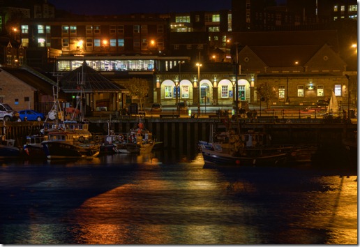
Dock End

Back down the hill for this view of moored fishing boats. The long exposure makes the water look to be flowing much faster than it is. The overall yellow cast is quite pleasing – it makes the scene seem much warmer than it felt. As in the previous image, the lighting in the buildings defines them better than the daylight images. We can now discern the railway station, library, police station and hospital where they tend to merge together during the day.

ISO 200, f/5.3, 2 sec.

exercise 4.09.11 Pier Road

Pier Road

Still on the East side of the harbour, reflections of the lights of the amusement arcades, pubs and restaurants colour this image. The long exposure has caused the water to ‘blur’, but I like the effect for this shot.

ISO 200, f/22, 20 sec.

exercise 4.09.12 The Ship

The Ship

I wanted to try and show the motion in the water, by using a faster a faster shutter speed, so I used ISO 640 for this image with settings of f/4.0, 0.4 sec. Still quite slow, but the water ‘blur’ is much reduced. The view now portrays a warm summer evening with drinks ‘Al Fresco’, instead of the reality – a cold November evening with the clients outside for a smoke!

exercise 4.09.13 Reflected Neon

Reflections

In a further attempt to reduce the water movement (I sound like Canute!) the ISO was increased to 6400 for this shot, resulting in a shutter speed of 1/15 sec at f/4.0. Still not good and the depth of field is quite short at this aperture. The original was very noisy, particularly in the dark areas – this was cleaned up using Topaz De-noise 5 plugin for Photoshop.

The vibrancy of these reflections is something that is rarely attained in daylight.

exercise 4.09.14 Closing Time

Closing Time

Moving back towards the bridge we pass shops as they start shutting up for the night. This lone figure in the poorly lit street tells a real story. Again, using ISO 6400 at f/22 a shutter speed of 1/30 sec enabled this hand held shot. Topaz De-noise 5 was again used to clean up a very noisy original.
exercise 4.09.15 Marine Parade

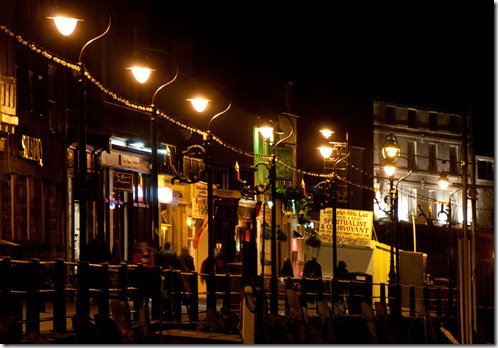
Marine Parade

Back to the West side for this image and back to ISO 200. I wanted to use the recessing lights and the handrail for their lead lines and the diminishing buildings to create depth. f/5.6, 0.5 sec. Taken at a fairly long telephoto zoom, I wasn’t worried about sharp detail throughout. The lens has compressed the distance to a degree, but the lead lines have compensated this.

exercise 4.09.16 Amusements

Arcades

These lights look so inviting. Again, the lead lines create depth – this time due to using a wide angled lens. The strength of the lights in the dark conditions really make them stand out.

ISO 200, f/20, 2 sec.

exercise 4.09.17 West Pier

West Pier

The warm cast produced by the lights belie the reality that there’s a cold wind blowing off the sea (hence the lack of promenading). Recessing lights, handrails and Daleks lead the eye into the darkness. I like the starring effect of the street lights.

ISO 200, f/20, 30 sec.

exercise 4.09.18 Abbey

Whitby Abbey

Taken from the West Cliff, the lighting of the Abbey, is contrasted by the yellow glow from those on the steps and graveyard. The 199 steps give a leading line from the town to the Abbey while the interest in the town buildings is maintained by the street lighting. A higher ISO was needed, as the lighting was really quite dim.

ISO 500, f/32, 20 sec.

The following two images were taken in the central mall of the Metro Centre. I used my Nikon P5100 compact camera for these, as it’s less conspicuous and I didn’t want to delete the images as I’d had to in Sunderland Bridges shopping centre – if you’re a photographer stay clear of there, because you’re not welcome. It seems that the Metro Centre is much more tolerant!

The camera ISO was set to Auto in programmable mode and was hand held.

exercise 4.09.19 Metro

Stainless Shoppers

There’s a mix of fluorescent and tungsten lighting in use, but they’ve created an overall warm light. ISO 367, f/2.7, 1/60 sec

These shiny figures are stationed all around the complex as part of the Xmas decorations. I think they’re excellent.

exercise 4.09.20 Metro

Xmas Decorations

The decorations are quite a spectacle. The very white lights of the decorations stand out against the warm lights of the mall and shops.

ISO 342, f/2.7, 1/60 sec

I’ve really enjoyed this exercise. It’s been a difficult job deciding which images to use and quite a lot of post capture work, but I’ve been impressed by the results. It’s put a whole new slant on some of my landscapes and the lighting is so vibrant.