As the exercise is to produce images with colours that match those in the colour wheel shown in the course, I’ve copied that wheel as a reference – Personally I think the blue shown has a significant violet cast. This could be down to the printing or it may be the hue that is being aimed for. In the exercise I’ve tried to get the hues shown on this wheel.

I’ve used the cameras in three frame bracketing mode and always with a tripod. The camera modes have been, shutter priority, continuous high speed shooting and manual focus for the macro images.
Starting with Red I’ve used a Pelargonium which we’ve grown in the conservatory. I tried with other red sources (roofs, walls, other plants and flowers) but this was much closer to the red hue being targeted.

Under exposed by 0.7 step

Auto exposure

Over exposed 0.7 stop
In this case I think the under exposed image has the closest match to the colour wheel.
For the orange source I’ve used an Oriental poppy which I grabbed between rain showers. I tried various other sources (brickwork, gladioli, lichens and sunsets) but this flower produced a hue which is nearer to the one in the wheel.
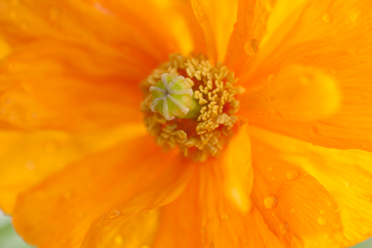
Under-exposed by 0.7 stop

Auto exposure

Over-exposed by 0.7 stop
For the orange I think the over-exposed image is closer to that in the wheel.
I tried, evening primroses, hypericom and asters, but yellow lichens at the Wheal Martyn China Clay museum, St Austell, provide the images for this section:

Under exposed 1 stop

Auto exposure

Over-exposed 1 stop
The yellow in the underexposed image has the brightness required to match the colour wheel.
Still in Cornwall, the giant’s head in the Lost Gardens of Heligan is the source for the green images. I know there are several greens in the image, but the more dominant one – his hair – is closer the one in the wheel, which I feel has a yellow cast to it.

Under-exposed 1 stop

Auto exposure

Over-exposed 1 stop
It seems to me that the green in the under-exposed image more closely resembles that in the wheel.
For the blue set I’ve used our laundry basket. Cornflowers were close but not quite as good as this. I also tried using the sky, hydrangea, stained glass windows, stuffed toys and gladioli, but the laundry basket had the strength of colour I was looking for.

Under-exposed 0.7 stop

Auto exposure

Over-exposed 0.7 stop
I think over-exposed image has a closer hue than the other images.
The heather is in full bloom on the moors just now and has a violet which is close to the one in the colour wheel. Another gladiola had a close match, but I’ve already done that. I tried hydrangea, clematis, cotinus and orchids, but settled on these images. It was interesting to note that shooting into the sun produced different results from shooting away from it (as in these images).

Under exposed 0.7 stop

Auto exposure

Over exposed 0.7 stop
The over exposed image works best for this section.
Using the selected images, they can form a new wheel, like this:

This was more of a challenge than I anticipated. It took longer than I thought to find examples which looked reasonably close to those on the colour wheel. There are so many variations within each of the six colours. It’s been an enjoyable exercise and I’ve learned that it’s not easy to find exact colour matches. The bracketing function of the camera has been really helpful for this and could be useful if the exact colours were needed (unless HSB changes in Photoshop was allowable). The effect of exposure is obviously another consideration when taking an image – it may conflict with other criteria (shutter speed / aperture settings) so a consensus may have to be arrived at.
The exercise has been very interesting. I’ve learned a lot from it. Obviously there are many ways to affect colours in Photoshop, but doing its good to do it purely in camera.


