Steve's Progress with OCA

This blog is for the learning log for Steve Estill's progress in the study for the BA in Photography with OCA.

The first Module was Photography 1 - The Art Of Photography.
The second module was Photography 1 - Digital Photographic Practice - started in January 2012 and finished in May
For the third module see the new blog at http://moreocapnp.blogspot.co.uk/

Tuesday, 4 October 2011

Exercise 4.01–Measuring exposure

Part 1

The following six images were made darker or lighter, by adjusting the exposure, for the reasons given:

exercise 4.01.01 darker

‘At the setting of the sun’

This image was overexposed 4 stops to overcome burnout from the sun. The foreground has become almost a silhouette, but I think the treatment has made this view of the battery parade into a strong image with a story to tell.

exercise 4.01.02 lighter

‘It’s fine even when it’s wet!’

This was taken on a dull, overcast and very wet morning. It was underexposed two stops to lighten the image and the blacks brought back in and the contrast increased using Lightroom. This has had the effect of making the day look brighter and enhancing the few colours to make another image with a story to tell.

exercise 4.01.03 darker

‘Backlit Tulip’

This image was taken in the garden using the sun for backlighting and over-exposed by two stops. The exposure readings were taken from the flower petals, which also helped to darken the background.

exercise 4.01.04 darker

Misty Bandstand

Here’s another overexposed image, with the darker areas reduced almost to silhouettes. This had to be done, to prevent burn out in the sky areas – the morning was in fact much brighter than this.

exercise 4.01.05 lighter


Sneaton Forest morning

This image was underexposed by 1 stop to make it lighter. Without this adjustment, the view would have been much darker and contrasty, with the sunbeams being far lighter than the rest of the picture.

clip_image002

Backlit daffodil

This image was overexposed, to make the background much darker. The details in the flower were also enhanced by this treatment.

Part 2.

The following sets of images were taken using automated bracketing in camera. They have been rearranged, so that they are shown in the order required in the exercise. I have been regularly bracketing images for several years, for use in HDR software, so nothing new here for me I’m afraid. The camera was tripod mounted in each case. I used matrix metering for a better ‘average’ value.

The first five images were taken in Sneaton forest. Because of the variation in lighting here images really benefit from bracketing.

exercise 4.01.07 1

exercise 4.01.07 2

exercise 4.01.07 5 one under

One stop overexposed

For this set I think the half stop overexposed image is slightly better than the ‘average’ exposure image. The slightly darker image has an air of intrigue, while the lighter images make the forest seem clean and safe – they also have burning out in some areas. The first image is far too dark for my liking.

The next set of Whitby West pier at sunrise were chosen because of the uncertainty with exposure at relatively low light levels. Bracketing takes out some of the uncertainty.

exercise 4.01.08 1

exercise 4.01.08 2

It seems that the exposure overcompensated for the low light conditions as the best results for these images are those that have been over exposed. I prefer the one that’s half stop over exposed, which gives what I perceived as being the actual light at the time.

An early morning walk along the cliffs North of Sandsend provided the next series. I wanted to catch the early light in this view, knowing that the cliffs would be a stark contrast to the light. I anticipated using the images with HDR to make the final picture. The fishing boat was a real bonus.

exercise 4.01.09 1

exercise 4.01.09 2

The results of these exposures caused something of a quandary – the darker images showed off the early sunlight and sea reflections to the best effect, but the lighter ones brought out the detail in the fence / foliage.

exercise 4.01.09 tonemapped

The only viable solution was HDR and tone mapping.

The next images were of Goths. I always use bracketed images for the goths, as they work so well in HDR.

The first was taken in Whitby Abbey grounds. I wanted to get the blackness of her clothing and jet jewellery while keeping the detail in the stonework.

The second was taken outside the grounds – I was leaving as he was arriving. His makeup took hours to complete.

exercise 4.01.10 1

exercise 4.01.10 2

I feel the best exposure was the ‘average’ one. This maintains the blacks but still allows the moonstones in her jewellery and her complexion to look right.

exercise 4.01.11 1

exercise 4.01.11 2

Again, the ‘average’ exposure looks to be the best for this set, because the textures of his mask show well, without any burn out. In the under exposed images, his eyes show much better. Obviously the way to use the images is with HDR, like this:

exercise 4.01.11 3

The last set of images was taken on the beach at sunset. Again, it’s a difficult call trying to judge the best exposure for these conditions, so bracketing comes into its own here.

exercise 4.01.12 1

exercise 4.01.12 2

I think the one stop over exposed image works better here. The burn out is reduced and the darker colours give an overall feeling of a warm summer evening – which it was. The blacks are blacker and the contrast much stronger. The average to under exposed images are too light – they just look too thin.

Project - The Intensity of light

Part 4 - Light

Sunday, 18 September 2011

Assignment 3–Colour

The following 16 images are collected in four groups with four images per group:
  • Complementary colours
  • Similar colours
  • Contrasting colours
  • Accented colours
The first image, showing complementary colours, red and green is of a Peacock butterfly in knapweed, taken on Reivaulx Terraces


Peacock on Knapweed – complementary colours 

The complementary colours make the butterfly stand out from the foliage. The strong red initially brings the viewer’s attention to the insect. The attention stays in this area to explore the detail of the butterfly. The off centre positioning of the butterfly in the frame helps keep some dynamism in the image – it looks as though it may not be staying long!
Although the colours may not be equally balanced in the image, I feel the balance in the composition still makes it work.
 
The second image using complementary colours, blue and orange, is of a boat moored in Whitby harbour.


Two Buoys – complementary colours 

The deep blue and bright orange colours work well in the 2:1 ratio. The reflections enhance the ratio and give added interest to the image. The eye-line of the boat’s waterline leads the viewer into the image. The immediate attraction in the picture is that of the bright fenders, but I feel the interest moves to the orange reflections and then to the ropes. An initially simple image becomes one of continued interest.


Fly Agaric – complementary colours 

Red and Green are easily found in the wild. The bright red brings the viewer’s attention immediately to the top of the mushroom. The interest then moves to the detail in the rest of the image. I felt that the mushroom needed to be centrally placed in this image, but with the cap in the top half. The tripod was inverted to get this low angle shot – I also used 90 Deg angled viewer.


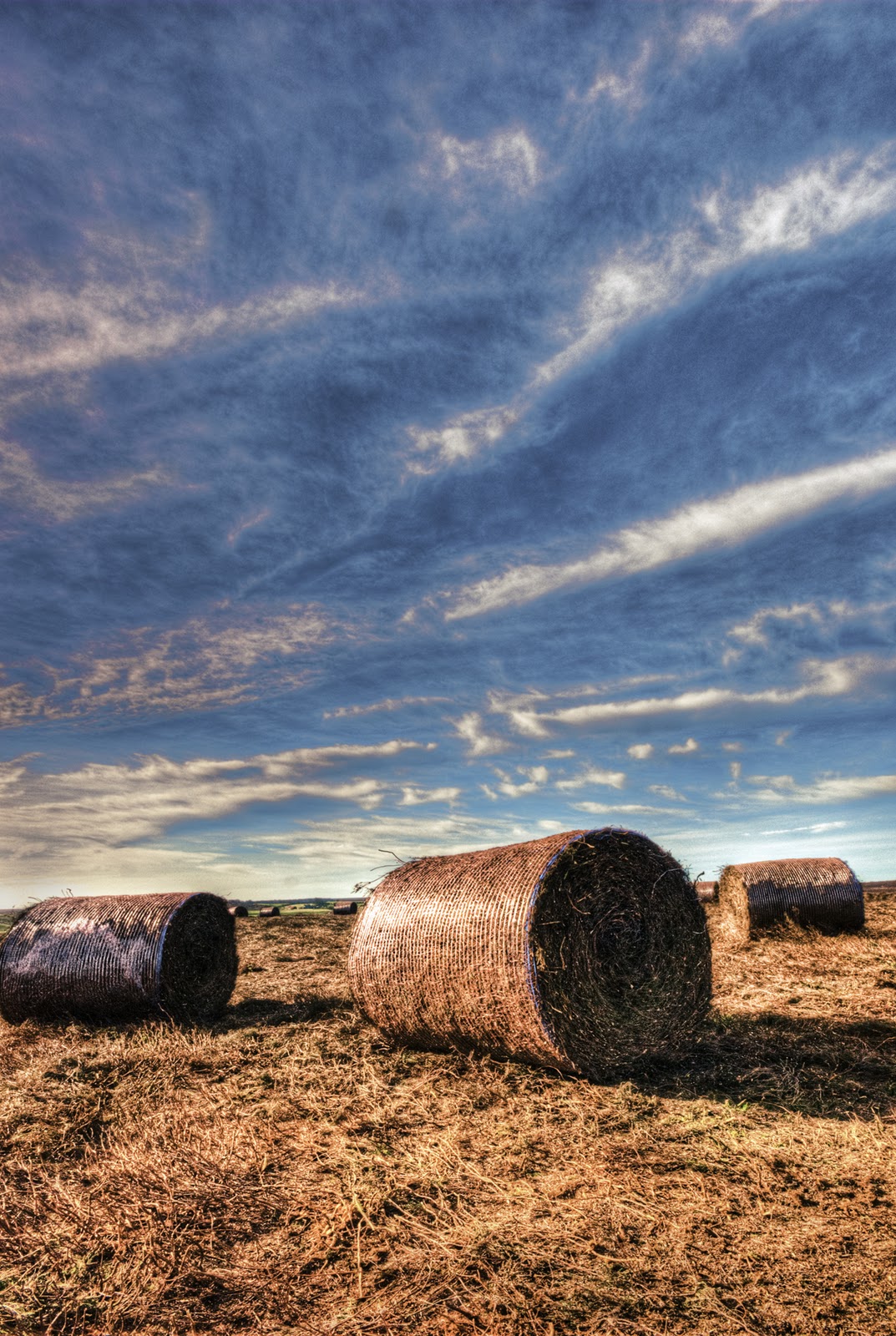
Heather Bales – complementary colours

The orange bales of heather complement the blue sky. The 2:1 ratio again works well here. The shades are more pastel than in the previous image, but they still work well together. This image benefits from the leading lines of the clouds and the perspective of the bale sizes which give the image a lot of depth. I used three bracketed images to produce this picture, using HDR software.


Ralph’s Cross – similar colours 

Blue and violet work together, to create this pleasing image. This cross is used as a symbol for the North Yorkshire Moors National Park. I like the blurring of the cross, which gives a sense of place and is still really the main point of this image, even though it’s the heather in the foreground that’s in sharp focus.

For the next image it’s back to the garden.


Allium over geraniums – similar colours 

The violet and red work well in this macro image. Again the overall impression is one of warmth, which must be due to the high percentage of red over the cooler violet. The repeating shapes (or the suggestion of them) give this image more impact.

Still in the garden we find Orange and Red similar colours


Lily Stigma and Stamen – similar colours 

This macro image uses the similar colours to produce an overall warm feeling. The red in the stigma and stamen blend well with the orange of the petals. Their strong diagonals and implied lines make this an easy image to enjoy.


Eryngium – similar colours 

The blue flowers of the eryngium blend well with the green of its leaves. The cold colours don’t seem to produce a ‘cool’ image to me. Maybe it’s the red in the stems, or the obviously bright, sunny day, but these flowers give me such a lift.


Moorland Track – colour contrast 

The contrasting violet and green make this image really vibrant. The green along the track makes the lead-in very strong while the sunlight on the heather adds more interest. The patches of sunlight on a generally overcast and very windy day were worth waiting for.


Amaryllis detail – colour contrast 

This macro shot was framed this against the yellow curtains to give the contrasting colours. It does tend to make the stigma less obvious as it blends in with the curtain somewhat, but I think the overall image works well. Detail in the rest of the flower is enhanced by the contrast.


Autumn Leaves – Colour Contrast 

Green and orange really shout in this image. I’ve used motion blur over the original image then brought back the bracket fungus and fallen branch slightly. His treatment has enhanced the verticals in the trees, but you can still make out the dappled lighting among them – it’s a place to get lost in!


Liquid Lunch – Colour Contrast 

Violet and orange have a pleasing harmony in this image. Maybe the orange is a ‘yellow variant, which would tie in with the Van Goethe ratio for violet / yellow, but I’m pleased with this outcome. I settled for the water, because it was a little early for Shiraz and Drambuie! I had the washing up to do too!


Amaryllis – Colour Accent 

Obviously the same flower I used for the ‘colour contrast’ section, but this time used to show the colour accent by using the contrasting colours to accentuate the yellow stigma and stamen within the red petals. I intentionally placed the throat of the flower off-centre, to give the stigma / stamen an implied line into the foreground.


Mooring Buoy – Colour Accent 

The red buoy floats in the predominantly blue water, so the contrasting colours immediately draw the viewer’s attention. The further details in the contrasting yellow floating rope and complementary orange water reflections are then evident. So there are lots of things going on here, from what at first seems to be a very simple image. The warm / cool colours and different colour interactions make this an exciting image to me.


Moorland Farm – Colour Accent

The red roof of the farm complements the overall green of this image. The imbalance of the complementary colours (according to Van Goethe) draws the eye initially to the farm buildings, which are obviously the main subject in the image, but there’s much more to be seen here – look at the cattle; the fields cut for silage; the lone tree in the field. There’s a farm track at the top of the picture and a lesser one at the bottom where the telephone line runs. There’s a dead tree to the left and what’s that red implement to the right? So initial impressions can draw the viewer into an image that tells such a lot of stories, but the initial draw is so needed.


Red Grouse – Colour Accent 

This was a case of being at the right place at the right time. Being a voyeur of the moorland farms needed a long lens and a tripod, so I was inadvertently prepared. I didn’t know I was being watched until I turned round.
His red crown is complementary to the almost green in the background, but similar to the violet in the heather in the foreground and in the distance. His stance demanded that he be framed almost centrally. The sharp focus of the bird while all around him is in soft focus further concentrates the vision. I just can’t help but return his stare!

So that’s been an interesting section. It’s raised some questions for me, which I’m sure will be contentious, but it’s been a very enjoyable project. Long may it continue!

Further research into colour

I’ve used various books / websites in the study of colour. Of particular note are:

  • Michael Freeman – Colour (Digital Photography Expert series), which not only covers all the aspects of this part of the course, but addresses colour management of the digital process, from screen calibration to printer profiling colour space etc. – a really useful, common sense book.
  • Josef Albers - Interaction of Color. This addresses the way different colours react with each other to cause the same colour to appear differently when placed alongside different hues. An interesting study, using predominantly coloured squares. The way these colours interact needs to be considered when framing an image.
  • Leatrice Eiseman – Color: messages and meanings. While this is primarily a designer’s book, with references to Pantone numbers, it covers the various colour scheme categories which can be used with the twelve colour wheel, such as monochromatic; analogous; complementary; double complementary; triad; tetrads; adventurous analogous etc. It lends itself to the argument that the schemes are being made to fit the rule. It also has the statement that “It is important to know that colour combinations need not be strict interpretations of each of the categorised schemes. They simply offer possibilities, but do not have to be rigidly followed.” That says it all for me – if it looks and feels good to me then the combination works (for me at least).
  • Edith Anderson Feisner – Colour. A very well presented book which delves into the different colour models and wheels developed by several colour theorists. For instance, the 5 primary colour wheel developed by Albert Munsell, the 4 primary Visual Wheel, pigment, process and light wheels. There is also an interesting chapter on the theorists themselves, including Da Vinci, Newton, Harris, Von Goethe, Albers and Johannes Itten.
  • Johannes Itten is possibly best known for his book ‘The Art of Color’ and its condensed version ‘The Elements of Color’. His 3 primary colour wheel seems to be the more generally accepted model.

Ittens Wheel

The Itten’s Wheel uses red yellow and blue in the centre triangle, with the secondaries surrounding it. The outer wheel combines the primaries and secondaries with the tertiaries between the points of the two inner triangles.

To say that some colours are complementary, so they work together, and to further attribute numerical colour strengths to the primary and secondary colours seems to me to be an attempt to make a pleasing image fit a rule. There are so many different schemes and ideas regarding what’s pleasing to the eye and what ‘clashes’. Different people perceive the same colour with different values and attributes – for instance: green is a vibrant colour to some but a form of dull camouflage to others; red is a warm glow or a warning of danger, etc. I’m more of the mind that ‘beauty is in the eye of the beholder’ and that what I prefer to run with.

Still. I’ve gone into this with an open mind and have learned a lot as I’ve gone along – although I’m still not 100% convinced. I’ll produce Assignment 3 in line with the tenets of this section. And I love Colour!

I was advised to look at the work of Peter Saville - in particular his abstract colour cityscape series. It wasn’t easy to find, but having seen it I really like what he’s done to the images. I feel I could also produce this type of work. I find myself being frustrated by the ‘rules’ and yearn to be more creative with my photography. My work with the PSA is predominantly in the creative photography sections - their definition of ‘creative’ is ‘altered reality’ which is what I enjoy . I haven’t been able to spend enough time in this area since I started the OCA course, so maybe I’ll encompass some of this in the assignment - it could then also be used with the PSA groups and exhibitions.

Monday, 12 September 2011

Exercise 34 – Colours into tones in black and white

I’m obviously using digital cameras for the whole of the module. For this exercise I’ve used the Nikon D300s with the Nikkor 18-200 mm VR lens.

The Black and White filters used were the presets within Photoshop

Exercise 34 01Original Image.


The objects I chose for this still life are watercolours paints (including palette, tubes and inktense sticks), wax crayons, threads and coloured card. I printed my own mid – grey paper using Photoshop.

Exercise 34 02 No filter

Black and White – No filter

Exercise 34 03 Yellow filter

Black and White – Yellow filter

With this filtration, the yellows have become almost white. It’s interesting to note that colours which contain yellow (particularly the oranges and browns) have become lighter. The blues and greens seem to have become darker, but this may be due to the relative tones.

Exercise 34 04 Red filter

Black and White – Red filter

The reds have become while the yellows have now returned to their original shade. Again, the orange and browns have become lighter, due to their red content.

Exercise 34 05 Blue filter

Black and White – Blue filter

This filter produced the expected results, where the blue card and blue bands on the tubes became almost white. Some blues (cotton and inktense sticks) still retain some darker tone, possibly due to mixtures of other colours.

Exercise 34 06 Green filter

Black and White – Green filter

As expected, most of the greens have become much lighter – the exceptions being the cotton, tube and inktense stick which have become lighter, but not as much as the card.

This exercise has emphasised the different shades of the various colours which don’t always agree with the ‘pure’ colours of the filters. Other than that, I’ve not gained much from the exercise. The use of the sliders in the Black and White adjustment layer of Photoshop was already known and well used by me. I’ve also used the filters with film cameras back in the days of my darkroom. Still – it’s been an interesting exercise.

Tuesday, 23 August 2011

Exercise 33 - Colour relationships

Starting with the easy one – Red and Green can be found everywhere. In this case it’s our apple tree. 
 
The red – green ratio is about 1 : 1 and the colour looks pretty well balanced. The dimensions of the apple fit comfortably within the green of the leaves, so this defined ratio seems to work.

 For the orange – blue combination it’s off to the harbour again.

 
This boat with its bright mooring fenders was the final image I came up with. With the sun directly behind me the colours were really strong. The reflections enhance the image. This 1:2 orange: blue ratio seems to work well too.

 
The sketch was interesting in that the blues and yellows took up so little of the actual colours – the main constituent was black! There was a significant amount of brown too.

With the heather blooming on the moors this seemed to be the logical place to find the yellow: violet combination.

 
This clump of ragwort growing in the heather was just what I was looking for. It was quite windy so I had to use a fast shutter speed, with the consequent wide aperture and loss of depth of field, but I’m still happy with the result. The ragwort stands out from the heather, so maybe the 1:3 yellow: violet ratio is a bit off in this case. It may be because of the bright sunlight which has given more vibrancy to the yellow. It does still have a pleasing colour balance.
 
For the second part of the exercise I’ve used the garden, where the plants are those that among their other attributes have been chosen for their colours.
 
Yellow / Green


These grasses, taken with the sun behind them have produced what I think are a very pleasing image. The colours are adjacent on the colour wheel. I find the image really vibrant. The overall feeling is one of warmth – probably because of the high percentage of the bright yellow, which overcomes the cooler green.


Blue / Yellow
 
Again the colours in this Hydrangea are not complementary, but still work well. The colours are pastel, which helps to blend them together better. Having two colours from opposite sides of the ‘warm / cool’ sections of the wheel may help. I would have thought that the green in the background, combined with the blue of the flower would have created an image with an overall ‘cool’ feel, but the yellow in the image must have warmed it. 

 
Violet / Green
 
This combination of colours has resulted in an image which radiates ‘warmth’. How that can have happened with colours which are predominantly ‘cool’ surprises me. It could be due to the obviously bright sunlight, or the warm whites in the image. There’s also a pleasant colour balance here - Maybe it’s the pinkness of the ‘violet’ that works with the green, but I would have thought it violet / green overall. The pastel shades of the flowers blend together with the green background easily. I really like this image - you can almost smell them.

 
Orange, blue, violet, green
 
I enticed the fly to this cornflower by placing a little honey placed in the centre of the flower, which enabled setting up the macro lens on a tripod and waiting for the fly to arrive.
There are combinations of complementary colours in this image:
  • Red of the fly’s eyes with the green of the background.
  • Blue of the outer petals with the orange of the fly’s abdomen.
  • Violet of the inner petals with the hint of yellow from the honey.
The ratios of the colours don’t comply with those suggested by Von Goethe, but I find the image exciting. The mixture of colours and particularly the ‘zing’ of the green make this image ‘shout’

 
The sketch was different - I used it as a way to try out different watercolour methods – in this case Letraset water-based Promarkers along with the Inktense and water soluble sketching washes. I don't think my sketches will ever sell, but I'm enjoying them. It's surprising how much can be learned about an image this way.

So while there is some merit in using the suggested ratios of primary and secondary colours, it’s obviously not a hard and fast rule to follow. Neither is it necessary to always use complementary colours. At the end of the day, beauty is in the eye of the beholder and what works for one may not necessarily work for another. 
 
It’s yet another aspect of composition which needs to be considered when framing the image. One which I find more exciting than any of those studied so far.