The following 16 images are collected in four groups with four images per group:
- Complementary colours
- Similar colours
- Contrasting colours
- Accented colours
The first image, showing complementary colours, red and green is of a Peacock butterfly in knapweed, taken on Reivaulx Terraces
Peacock on Knapweed – complementary colours
The complementary colours make the butterfly stand out from the foliage. The strong red initially brings the viewer’s attention to the insect. The attention stays in this area to explore the detail of the butterfly. The off centre positioning of the butterfly in the frame helps keep some dynamism in the image – it looks as though it may not be staying long!
Although the colours may not be equally balanced in the image, I feel the balance in the composition still makes it work.
The second image using complementary colours, blue and orange, is of a boat moored in Whitby harbour.
Two Buoys – complementary colours
The deep blue and bright orange colours work well in the 2:1 ratio. The reflections enhance the ratio and give added interest to the image. The eye-line of the boat’s waterline leads the viewer into the image. The immediate attraction in the picture is that of the bright fenders, but I feel the interest moves to the orange reflections and then to the ropes. An initially simple image becomes one of continued interest.
Fly Agaric – complementary colours
Red and Green are easily found in the wild. The bright red brings the viewer’s attention immediately to the top of the mushroom. The interest then moves to the detail in the rest of the image. I felt that the mushroom needed to be centrally placed in this image, but with the cap in the top half. The tripod was inverted to get this low angle shot – I also used 90 Deg angled viewer.
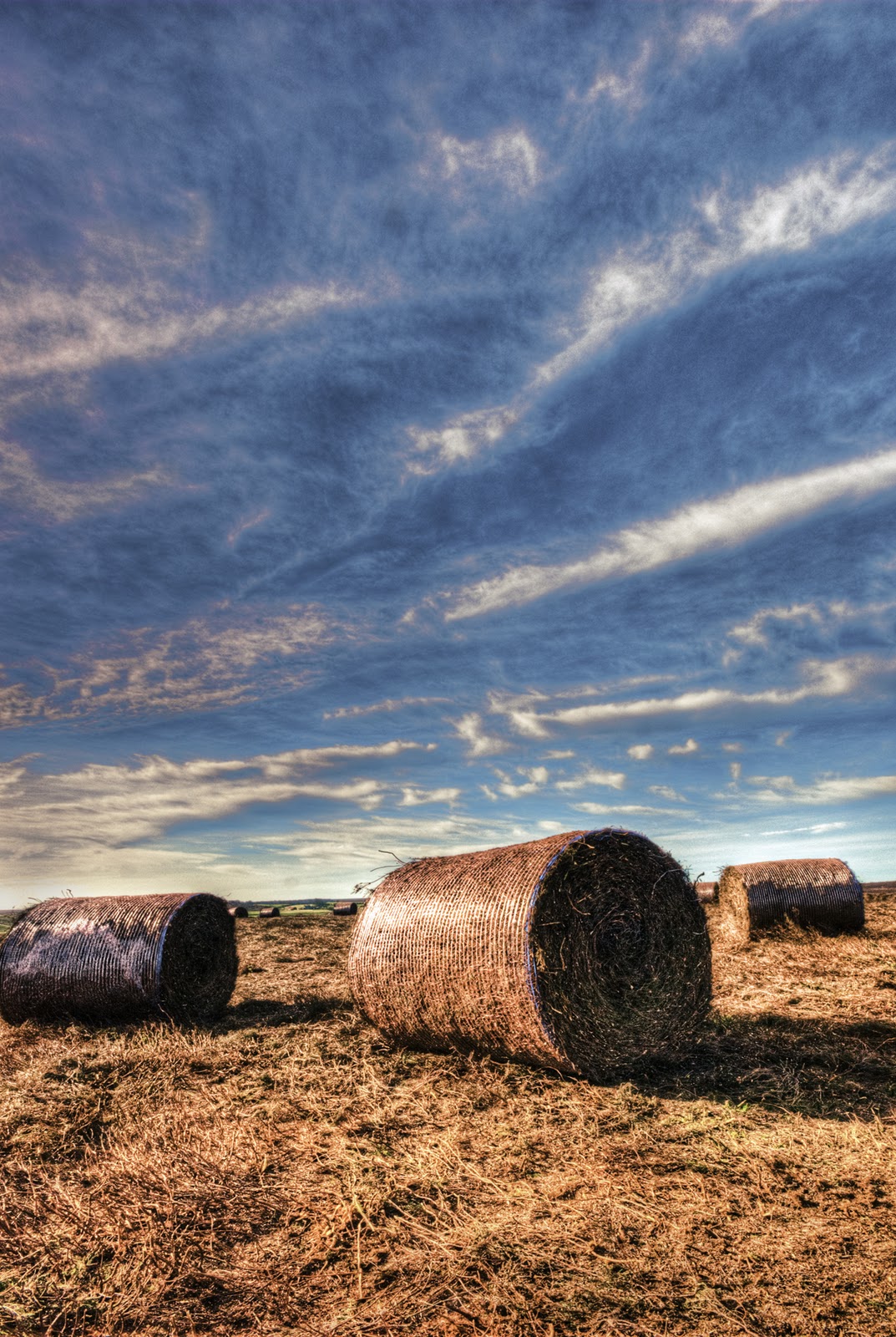
Heather Bales – complementary colours
The orange bales of heather complement the blue sky. The 2:1 ratio again works well here. The shades are more pastel than in the previous image, but they still work well together. This image benefits from the leading lines of the clouds and the perspective of the bale sizes which give the image a lot of depth. I used three bracketed images to produce this picture, using HDR software.
Ralph’s Cross – similar colours
Blue and violet work together, to create this pleasing image. This cross is used as a symbol for the North Yorkshire Moors National Park. I like the blurring of the cross, which gives a sense of place and is still really the main point of this image, even though it’s the heather in the foreground that’s in sharp focus.
For the next image it’s back to the garden.
Allium over geraniums – similar colours
The violet and red work well in this macro image. Again the overall impression is one of warmth, which must be due to the high percentage of red over the cooler violet. The repeating shapes (or the suggestion of them) give this image more impact.
Still in the garden we find Orange and Red similar colours
Lily Stigma and Stamen – similar colours
This macro image uses the similar colours to produce an overall warm feeling. The red in the stigma and stamen blend well with the orange of the petals. Their strong diagonals and implied lines make this an easy image to enjoy.
Eryngium – similar colours
The blue flowers of the eryngium blend well with the green of its leaves. The cold colours don’t seem to produce a ‘cool’ image to me. Maybe it’s the red in the stems, or the obviously bright, sunny day, but these flowers give me such a lift.
Moorland Track – colour contrast
The contrasting violet and green make this image really vibrant. The green along the track makes the lead-in very strong while the sunlight on the heather adds more interest. The patches of sunlight on a generally overcast and very windy day were worth waiting for.
Amaryllis detail – colour contrast
This macro shot was framed this against the yellow curtains to give the contrasting colours. It does tend to make the stigma less obvious as it blends in with the curtain somewhat, but I think the overall image works well. Detail in the rest of the flower is enhanced by the contrast.
Autumn Leaves – Colour Contrast
Green and orange really shout in this image. I’ve used motion blur over the original image then brought back the bracket fungus and fallen branch slightly. His treatment has enhanced the verticals in the trees, but you can still make out the dappled lighting among them – it’s a place to get lost in!
Liquid Lunch – Colour Contrast
Violet and orange have a pleasing harmony in this image. Maybe the orange is a ‘yellow variant, which would tie in with the Van Goethe ratio for violet / yellow, but I’m pleased with this outcome. I settled for the water, because it was a little early for Shiraz and Drambuie! I had the washing up to do too!
Amaryllis – Colour Accent
Obviously the same flower I used for the ‘colour contrast’ section, but this time used to show the colour accent by using the contrasting colours to accentuate the yellow stigma and stamen within the red petals. I intentionally placed the throat of the flower off-centre, to give the stigma / stamen an implied line into the foreground.
Mooring Buoy – Colour Accent
The red buoy floats in the predominantly blue water, so the contrasting colours immediately draw the viewer’s attention. The further details in the contrasting yellow floating rope and complementary orange water reflections are then evident. So there are lots of things going on here, from what at first seems to be a very simple image. The warm / cool colours and different colour interactions make this an exciting image to me.
Moorland Farm – Colour Accent
The red roof of the farm complements the overall green of this image. The imbalance of the complementary colours (according to Van Goethe) draws the eye initially to the farm buildings, which are obviously the main subject in the image, but there’s much more to be seen here – look at the cattle; the fields cut for silage; the lone tree in the field. There’s a farm track at the top of the picture and a lesser one at the bottom where the telephone line runs. There’s a dead tree to the left and what’s that red implement to the right? So initial impressions can draw the viewer into an image that tells such a lot of stories, but the initial draw is so needed.
Red Grouse – Colour Accent
This was a case of being at the right place at the right time. Being a voyeur of the moorland farms needed a long lens and a tripod, so I was inadvertently prepared. I didn’t know I was being watched until I turned round.
His red crown is complementary to the almost green in the background, but similar to the violet in the heather in the foreground and in the distance. His stance demanded that he be framed almost centrally. The sharp focus of the bird while all around him is in soft focus further concentrates the vision. I just can’t help but return his stare!
So that’s been an interesting section. It’s raised some questions for me, which I’m sure will be contentious, but it’s been a very enjoyable project. Long may it continue!