Steve's Progress with OCA

This blog is for the learning log for Steve Estill's progress in the study for the BA in Photography with OCA.

The first Module was Photography 1 - The Art Of Photography.
The second module was Photography 1 - Digital Photographic Practice - started in January 2012 and finished in May
For the third module see the new blog at http://moreocapnp.blogspot.co.uk/

Monday 27 February 2012

Exercise 2.06: Colour cast and white balance

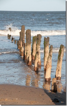
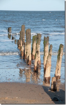
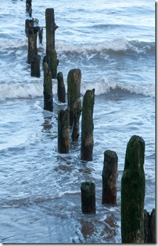
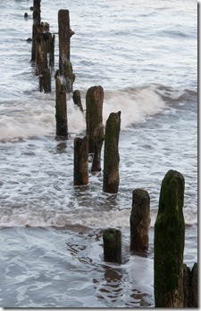
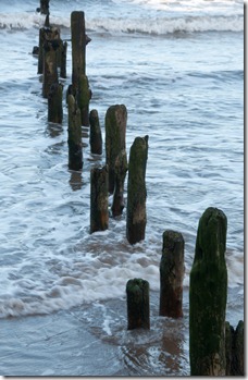
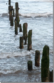
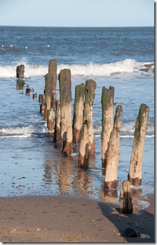
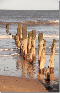
The following four images were taken on a sunny day with the scene in full sunlight. The white balance was changed for each exposure, otherwise they were exposed identically.

exercise 2.06 01   exercise 2.06 02

White Balance ‘Sunlight’ (5200oK)           White Balance ‘Shade’ (8000oK)

With the sunlight white balance I feel that the sky and sea are too blue. The colouring in the groynes looks about right.

The compensation used for the ‘Shade’ white balance has made the scene look much warmer than it was – the sea looks like the North Sea does in stormy conditions where the sand has been stirred up, which was not the case on the day.

exercise 2.06 03   exercise 2.06 04

White Balance ‘Cloudy’ (6000oK)          White Balance ‘Auto’ (4950oK)

With ‘Cloudy’ white balance selected I would say these are the nearest colours to those on the day.

The ‘Auto’ white balance has caused the blues to become more cyan than would have been seen.

The next set of four were taken on the same sunny day, with the groynes in the shade of the buildings behind.

exercise 2.06 05   exercise 2.06 06

White Balance ‘Sunlight’ (5200oK)        White Balance ‘Shade’ (8000oK)

The image taken with the ‘sunlight’ white balance is far too cyan / blue compared to the perceived colours on the day.

The colours displayed in the image with the ‘shade’ white balance are a lot closer to those seen at the time.

exercise 2.06 07   exercise 2.06 08

White Balance ‘Cloudy’ (6000oK)            White Balance ‘Auto’ (6450oK)

The image taken with the ‘cloudy’ white balance is too blue compared to the perceived colours on the day.

The image taken with the ‘auto’ white balance is very close to the perceived colours on the day.

Overall I would say that the ‘shade’ white balance was the most accurate in this case, but the ‘auto’ white balance was a close second.

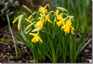
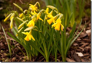
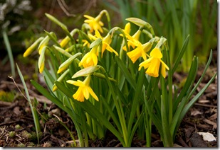
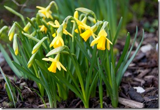
The next set was taken the following day which was overcast. This group of miniature daffodils was taken in our garden.

exercise 2.06 09

White Balance ‘Sunlight’ (5200oK)

The compensation for this image has made the yellows too yellow. The wood chips look too light too.

exercise 2.06 10

White Balance ‘Shade’ (8000oK)

The whole of this image has too much of a yellow cast.

exercise 2.06 11

White Balance ‘Cloudy’ (6000oK)

This is better – it gives an idea of what the colours should look like. However, it’s still too yellow compared to the colours on the day.

exercise 2.06 12

White Balance ‘Auto’ (4300oK)

These colours are the most accurate. The yellows are as they should be while the woodchips’ colour is a good representation.

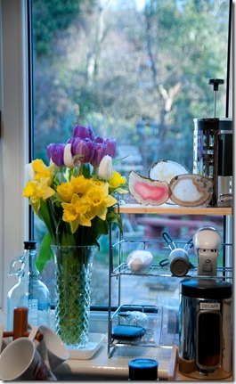
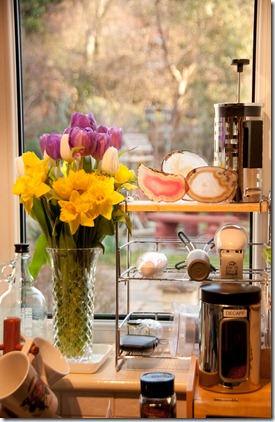
The following four images display a situation with mixed white balance. Taken in our kitchen (which uses incandescent lamps), while the first sunlight is appearing in the back garden.

exercise 2.06 13

White Balance ‘incandescent’ (3000oK)

The colours of the flowers geodes and the majority of the kitchen items look quite accurate, except the blues, which seem too strong. The outside light however looks much too cold and blue.

exercise 2.06 14

White Balance ‘Sunlight’ (5200oK)

In this situation the outside colours look accurate, but those inside have developed a very yellow /red cast.

exercise 2.06 15

White Balance ‘Auto’ (4050oK)

This setting is a reasonable compromise, but the inside colours still seem too yellow / red for my liking.

exercise 2.06 16

White Balance ‘Custom’ (3600oK)

Adjusting the white balance temperature in Lightroom has produced this image where the compromise gives colours which are nearer to those seen at the time.

So it can be seen that the presets give a reasonable ‘guesstimate’ for the general condition. Auto is a reasonable calculated guess, but it may be possible to improve on it.
Saturday 25 February 2012

Exercise 2.05: Scene dynamic range

This exercise looks at the dynamic range of scenes under five different lighting situations. I’ve used the D300s with 18-200 VR lens throughout, with noise reduction disabled.

The first is taken on an overcast day.

exercise 2.05 01

These are good conditions for photographing seagulls – if there’s any sunlight the glare from the white feathers is too great and highlight clipping occurs. This image was taken at 1/30 sec, f/14, exposing for the light area (white clouds in the sky) with no highlight clipping. The black stanchion reading for exposure was 1/8 sec, f/14, so the difference is two stops between lightest and darkest. Using Adobe Raw in Photoshop, the exposure could be increased by 2.8 stops until noise started to appear in the black stanchion.
The dynamic range of this image is EV 4.8. I expected a lower value than this. Obviously there was more available light than I thought.

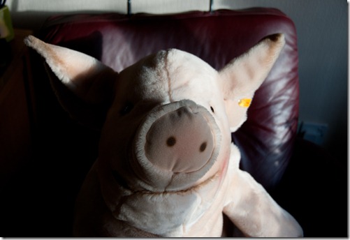
The second image was taken indoors using a daylight lamp as the light source.

exercise 2.05 02

This was taken at 1/6 sec, f/5.6 exposing for the light area (white cloth) with very slight highlight clipping in the blue channel, to the bottom right. The darkest area (black pig’s ear) read 1.0 sec, f/5.6, so a difference of 2.5 stops between lightest and darkest. Using Adobe Raw in Photoshop, the exposure could be increased by 2.55 stops until noise started to appear in the dark areas.

The dynamic range of this image is therefore EV 5.05. I was surprised at this level – I expected more with the contrasting black and white. It must be due to the light emitted by of the daylight lamp which has produced an unexpected blue cast. It’s also a soft light which doesn’t create hard shadow areas.

The next image looks quite ‘flat’, taken on a brightly sunlit but slightly hazy day.

exercise 2.05 04

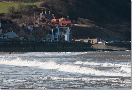
This was taken with an exposure of 1/80 sec, f/14. Exposing for the dark wooded area in the cliffs required 1/60 sec, f/14 – a difference of 0.5 stops. In Adobe Raw the exposure was increased by 2.15 stops before noise was appearing in the wooded area.

The EV for this image is therefore 2.65 – very low. It does have the advantage of being able to see lots of detail in the seafront buildings which would have been lost with higher contrast.

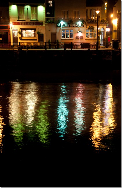
Looking for a high dynamic range image, the next image was taken at night, capturing the reflected lights from a harbourside inn.

exercise 2.05 03

Taken at 1.6 sec, f/5.0, there is some highlight clipping in the street lights, but the reflections are acceptable.

Exposing for the dark water required a 25 sec exposure at f/5.0 – a difference of 5 stops. In Photoshop Adobe Raw, the exposure was increased by 3.55 until noise began to appear in the dark areas.

The dynamic range for this image is therefore EV 8.55

The final image of this exercise was taken with the subject sitting near the window using only sunlight through the window as the light source.

exercise 2.05 05

An exposure of 1/160 sec, f/5.6 was needed to avoid highlight clipping. The dark area on his cheek required an exposure of 1/5 sec, f/5.6 – a difference of 5 stops. In Adobe Raw, the exposure was increased by 3.15 stops before noise occurred.

The image therefore has a range of EV 8.15 – another high dynamic range. I suspect this is due to the strength of the outside sunlight which creates very hard, dark shadows.

We’ve seen that the dynamic range isn’t just a function of the contrasting colours, but of the intensity and direction of the light source. High contrast images will have these strong light sources and hard, dark shadows.

Sunday 19 February 2012

Exercise 2.04: Your camera’s dynamic range

For this exercise I tried with white card using shadows under shrubs on a bright winter morning, but I couldn’t get the colour values in Photoshop’s sampler above 242 – this may have been due to the low sun which distorts the pure light, or the makeup of the card itself. I decided to use another source.

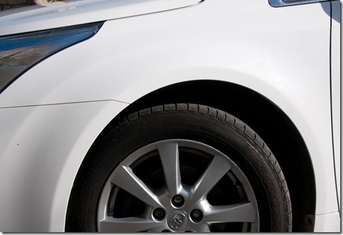
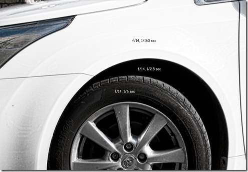
Our car is very white and has very dark wheel arches, so this seemed the obvious choice. Maybe not too scientific, but it was worth a try.

exercise 2.04 01

There’s some clipping in the reflections on the alloys, but none from the white (a little chipping but no clipping). The white sampled at R249, G248, B249, so a better white than from the card.

The noise reduction on the camera (long exposure and high ISO) was turned off; The ISO was set to 100; Metering was selected to ‘spot’; the shooting mode was ‘aperture priority’.

Having obtained the first exposure, which still had some clipping, I noted the settings and changed the shooting mode to manual. With the noted readings as a starting point, I increased the shutter speed until there was no clipping on the white paint and deleted the previous image. Returning the shooting mode to ‘aperture priority’ I then took spot exposures inside the wheel arch and also on the tyre wall. I kept the aperture setting the same for each reading, to make the EV calculation easier. These were as shown here:

exercise 2.04 02

The darkest area measured 6 stops below the white.

Using the Adobe Camera Raw in Photoshop I increased the exposure by 3.85 EV stops until detail in the wheel arch became confused with the noise.

Adding the difference between the darkest and lightest stops to the exposure compensation in Camera Raw, the dynamic range for the camera becomes 6 + 3.85 = 9.85 EV

Looking online at the tests for my camera, more controlled tests show an EV of 12.5. Evidently the lower ISO of 100 is obtained by underexposing the image by 1 stop. This process clips the highlight detail significantly, so better readings are obtained at ISO 200.

Anyway, it’s been a good exercise and I’ve learned some more about my camera. I’ll be using ISO 200 as the norm, unless I want slower shutter speeds than is reasonable at that setting.

Project – Dynamic range

Friday 17 February 2012

Exercise 2.03 – Your tolerance for noise

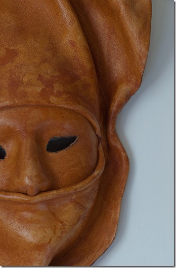
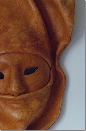
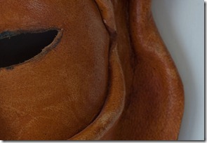
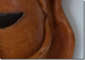
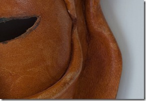
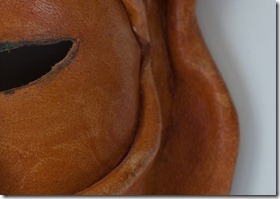
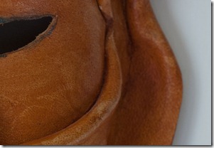
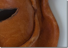
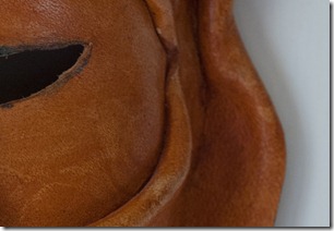
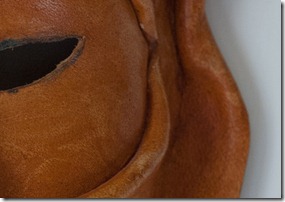
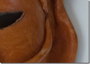
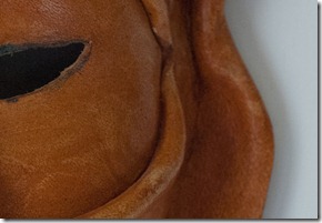
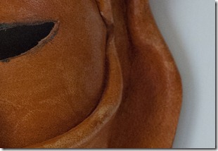
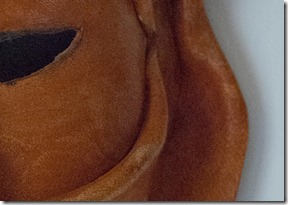
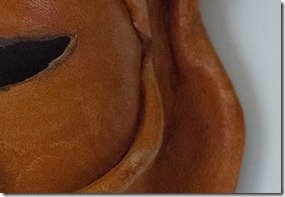
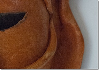
For this exercise I’ve used my Nikon D200 with the Sigma 150 mm macro lens. The D300s with its larger sensor was giving acceptable results throughout the range, so opting for the older model was a logical answer. The macro lens was chosen because of its wide aperture (f/2.8) which gave better control over the minimum shutter speed. I chose this African leather mask which is mounted on the wall of my study. The light was natural daylight on a hazy day, shining into through the study window. I disabled the long exposure and high ISO noise reduction on the camera. The camera was tripod mounted. I used aperture priority at f/5.6, which facilitated a starting shutter speed of 0.5 sec at ISO 100. The ISO was increased one step for each exposure. The images were converted with the standard RAW settings only.

As the images look quite acceptable when viewed at a relatively small size, the ISO 100 and ISO 3200 are shown for a general overview with small sections selected for each step to show the noise more accurately.

exercise 2.03 01 100

African Mask      ISO 100, 0.5 sec at f/5.6

exercise 2.03 16 3200

African Mask     ISO 3200, 1/50 sec at f/5.6

Although there is some noise in this image, compared to the previous one, it cannot be appreciated at this size.

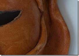
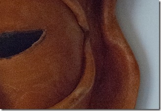
There now follow 16 images of detail taken from the above pictures with ISO ranging from 100 to 3200. The black areas in the eye and the shadows on the wall show the noise to best effect, so this is the area chosen for the detail.

exercise 2.03 01.1 100      ISO 100, 0.5 sec

No adverse noise to be seen.

                      ISO 125, 0.4 sec   exercise 2.03 02.1 125

No adverse noise or loss of detail.

exercise 2.03 03.1 160        ISO 160, 0.25 sec

No adverse noise or loss of detail.

                     ISO 200, 0.2 sec   exercise 2.03 04.1 200

No adverse noise or loss of detail.

exercise 2.03 05.1 250        ISO 250, 1/6 sec

No adverse noise or loss of detail.

                      ISO 320, 1/8 sec   exercise 2.03 06.1 320

There’s a small amount of noise in the eye and the shadows, but it’s still a perfectly acceptable image.

exercise 2.03 07.1 400         ISO 400, 1/10 sec

The noise has increased slightly, particularly in the eye. The edge of the mask is losing its relative sharpness.

                     ISO 500, 1/13 sec   exercise 2.03 08.1 500

Noise is now becoming more apparent in the darker folds of the mask. Detail in the leather is starting to become confused with the noise, so the detail must be suffering.

exercise 2.03 09.1 640         ISO 640, 1/15 sec

Noise has increased with the blacks now becoming lighter. Shadows to the bottom right are beginning to merge with the lighter wall.

                   ISO 800, 1/20 sec   exercise 2.03 10.1 800

Noise is now apparent across the image, extending now into the lighter areas. The darker areas are becoming lighter while the lighter areas are becoming darker. The detail is diminishing more markedly and the image is losing its contrast.

exercise 2.03 11.1 1000         ISO 1000, 1/20 sec

Exposure was exactly the same as for ISO 800. No great difference is seen between the two images.

                ISO 1250, 1/30 sec   exercise 2.03 12.1 1250

A further increase in noise can be seen with an associated loss of detail and contrast.

It should be said that viewed at full size in high resolution jpeg, the image would still be acceptable – maybe not as a print, but for display on a monitor it would look OK.

exercise 2.03 13.1 1600       ISO 1600, 1/30 sec

As the exposure was exactly the same as for the ISO 1250 image, no great difference can be seen between the two.

               ISO 2000, 1/40 sec    exercise 2.03 14.1 2000

The noise is so great here that sharp detail has been lost. Look at the edges of the eye compared to earlier exposures.

I think this would now be unusable as a quality print.

exercise 2.03 15.1 2500       ISO 2500, 1/50 sec

With greater noise and more loss of detail, the outer fold of leather is now losing its crease and the shadows on the wall are less distinct. The image is becoming much flatter

                ISO 3200, 1/50 sec   exercise 2.03 16.1 3200

If this image had been taken to show the detail in the mask it would have been useless. It could still be used at a smaller size, but I feel that the noise here is too great for most purposes.

The exercise has demonstrated the relationship between ISO setting and noise. It’s also worth noting that the noise reduction in camera had been turned off. Certainly with the D300s it was difficult to show anywhere near the amount of noise exhibited in the exercise. With its noise reduction working I’m sure the images, even up to ISO 6400 would have been easily acceptable. Noise reduction software – e.g. Topaz Labs DeNoise - would also help improve the image.

High ISO settings can be very useful when fast shutter speeds are required – sport action or freezing animal action etc. – or for shooting in low light conditions, so provided the implications of noise are appreciated they can be used effectively.

Project: Noise

Tuesday 14 February 2012

Exercise 2.02 Highlight clipping

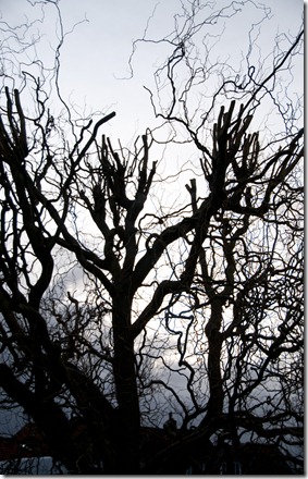
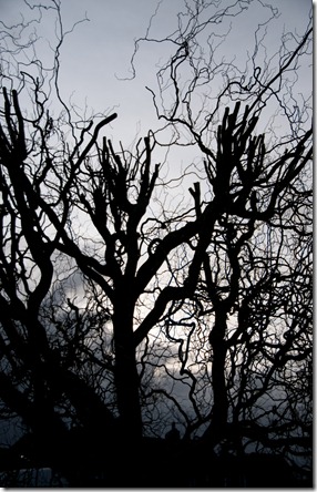
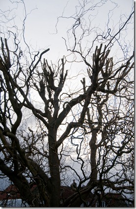
These images of the willow tree in our garden were taken into the setting sun, to provide a high contrast image to demonstrate highlight clipping. The camera was hand held and set to aperture priority at f/4.2, to enable high shutter speeds due to the windy conditions. I used 7-frame bracketing with steps of 1 stop – two of the increased exposure images were later deleted.

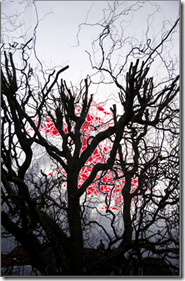
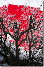
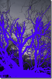
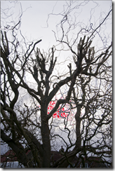
The screenshots are of the image in Lightroom with the highlight clipping shown in red.

exercise 2.02 01     image

At 1/1600 sec shutter speed, the setting sun caused some highlight clipping. As will be seen in subsequent images, this was the threshold at which highlight clipping could be seen.

Close inspection shows a blue colour cast in the small branches and twigs in the clipped area.

exercise 2.02 02     image

Increasing the exposure with a shutter speed of 1/800 sec caused much more highlight clipping.

Details in the tree are more easily seen in this image.

Colours at this exposure are brighter – the farmhouse rooftops show to be redder, but the highlights in the sky have been severely clipped with the loss of any detail in this area.

The blue colouring of the smaller branches and twigs in the clipped area has become more pronounced and red chromatic aberration can be seen on the outlines of the trunk and larger branches

exercise 2.02 03   image

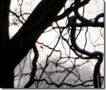
Reducing the exposure by one stop from the first image, with a shutter speed of 1/3200 sec has reduced the highlight clipping to just this tiny spot which could not be seen on the camera screen.

The sky now has more colours (more saturated) but obviously not as bright. Detail in the shadow areas is diminishing significantly.

The red aberration and the blue cast on the smaller branches and twigs have reduced, but it’s still there.

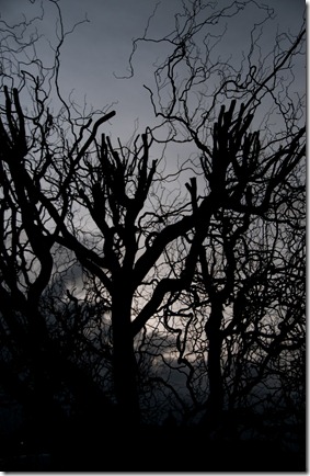
exercise 2.02 04

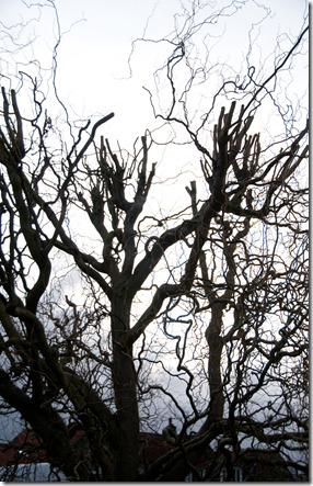
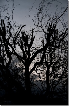
Reducing the exposure another stop, with a shutter speed of 1/6400 sec has removed all highlight clipping.

The sky is much darker but has more colours again. Shadows areas at the bottom of the frame have lost nearly all their detail.

The blue cast and red aberration can still be seen on close inspection.

exercise 2.02 05     image

With the shutter speed at 1/8000 sec the exposure is reduced to -3 stops.

At this exposure the day looks more like twilight.

The colours in the sky now seem to getting darker but not any more saturated than in the previous image. Maybe I’ve reached the saturation limit for this image.

Looking at the shadow clipping picture, above, the amount of detail that has been lost in the dark areas is really significant. The outlines of the farmhouse and vehicles cannot be discerned here.

The blue cast has almost disappeared and the red aberration has gone completely.

exercise 2.02 06      image

Looking again at the images in Lightroom, the over exposed image gives more detail and using 100% highlight recovery, with 10% fill light reduces the clipping while giving better sky colours and more detail in the tree / farm buildings. I think the overall image is quite flat, which could be improved by further processing, but I think that’s beyond the remit of this exercise.

So what have I seen?

· Reducing the exposure reduces highlight clipping, reduces chromatic aberration, loses detail in the shadows, increases the colour saturation (to a limit)

· Increasing the exposure has the opposite effect of above, but increases the brightness.

· I was unable to discern any distinct break between nearly white – total white in these images. Maybe it’s down to the image used – some white clouds may have worked better.