Steve's Progress with OCA

This blog is for the learning log for Steve Estill's progress in the study for the BA in Photography with OCA.

The first Module was Photography 1 - The Art Of Photography.
The second module was Photography 1 - Digital Photographic Practice - started in January 2012 and finished in May
For the third module see the new blog at http://moreocapnp.blogspot.co.uk/

Thursday 22 December 2011

Exercise 5.04 – Juxtaposition

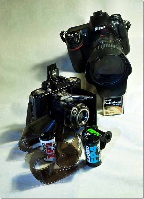
I’ve decided on a still life image, to illustrate ‘Classic Cameras’ by Colin Harding.
I’ve chosen two cameras, vastly different, to show in juxtaposition.
One is a Zeiss Ikon Super Ikonta A bellows camera, dating from the early 1930’s. It uses 120 film and has a coupled rotating-prism rangefinder, uncoated Carl Zeiss Jena Tessar 70/3.5 lens in a Compur shutter. This was one of my father’s cameras.
The other camera is a Nikon D300s digital camera dating from 2011. At present this is the top of the DX range. It is fitted with a 18-200 mm 3.5-5.6 VR lens. This camera is not shown in the book, but I’m sure updates will include it.
Both cameras are shown with their media (except that I’ve shown 35 mm film instead of 120) to give further comparisons.
The backdrop is natural calico.
exercise 5.04.01
In taking this image I used two light sources – a diffused daylight lamp and a multi LED worklight. I felt the daylight lamp (positioned above right) didn’t do the image justice, particularly in the lens detail, so the worklight was used for the shadow fill.
I used my D200 for this image – obviously I was photographing the D300s. I deliberated about using the media for each camera, considering that it may be too much, but decided that because it was such an important difference in the two cameras they should be added. I could have used pneumatic leads and radio controlled remote activation, flash lamps and digital flash etc. but decided that film / compact flash were enough for this image. 
 
While this image is a standard juxtaposition (two contrasting still life objects) I wanted to have a more illustrative image, so I decided to use my wife’s studio as a backdrop to show her work in progress. 

Work In Progress

I took this in the evening with the only light being her work light. I think the background gives just enough detail to show that it’s a studio. Her sketchbook shows the work which has gone towards her creation while the sewing machine shows the work on the fabric she’s making.
10 mm ultra-wide lens, tripod mounted.

Monday 12 December 2011

Exercise 5.03 Symbols

Symbols which reflect the given subjects may include the following:

Growth:

· Any plants, but particularly young saplings / sprouting seeds / seedlings. Trees are often used as symbols of long term investment growth.

· Tall buildings

· Arrows pointing upwards or outwards.

· Young children

· Stacked piles of coins

· Upward trending graphs

All these can be used to encourage investment, so they could be used in photographs for financial advertisements.

They could also be used as pointers to create implied lines in an image.

Used in juxtaposition, a sapling in front of a mature oak could be a really strong image of growth.

Excess:

This depends a great deal on what kind of excess is being considered

· Doing something in excess (being excessive)

Over-eating could be portrayed by overweight, fat animals – typically a pig.

Over-drinking could be portrayed by empty beer cans, groups of part full glasses and empty wine bottles.

Driving too fast could be portrayed by road kill, overturned cars etc.

All these subjects could be highlighted using road-signs with limits of the criteria or warning signs advising the safe limits. I suppose skull and crossbones could symbolise all these, when taken to the extreme.

· Having excess (too much left over)

Rubbish tips are an obvious sign of excess.

Litter and debris on beaches also points to too much waste.

These could be used anywhere that a point is being made regarding waste. Put it alongside the recycling symbols to make an impact, or alongside dead sea-creatures to shock.

Crime:

Crime comes in all kinds of situations, so there are lots of different ways of symbolising it and to warn against it.

Typically we see:

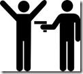
The thief with his swag bag  Crime the mugging  crime 2
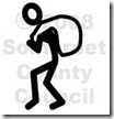
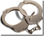
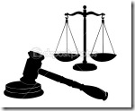
signs of capture  handcuffs  and justice   dep_3408995-Justice-symbols

These symbols could also be used in the advertising of insurance, alongside the umbrella described in the text (don’t forget the excess!)

Images of crimes can be really forceful in bringing home the effects on the victims, so these would be better used if the intention was to make the viewer aware of the implications of crime. Use these with the symbols of capture and justice to bring the message home.

Silence:

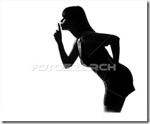
The most used symbol for silence is a finger placed vertically over the lips:
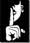
silence  It can be taken further  silence sihouette


Or stylised  silence-emoticon 

Another phrase is ‘zip it’ silence zipper-emoticon

All of the above are commanding the viewer to be silent, whether it means ‘no talking here’, or ‘don’t say anything to anyone’, or ‘it’s a secret’ etc. So these symbols could be used in this context in an image. The concepts could be used in composing an image.

Poverty:

There are many horrendous images of people in poverty but very few symbols depicting it. The logos of various aid organisations are available –

Save children  Homeless Outreach Logo  Habitat for the homeless  Carpenter's Homeless

But very few depicting poverty itself
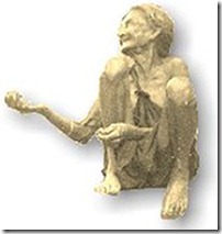
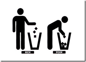
poverty logo   rich_poor

An image which always comes to mind is the begging bowl, I couldn’t find a symbol, so I’ve created this:
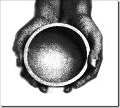
FOT746853

These could be used in campaigns to raise awareness of the problems. How they’d help alleviate the problems is another matter entirely!
Friday 9 December 2011

Exercise 5.02 – Evidence of action

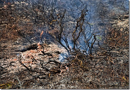
The annual controlled burning of the heather on the moors gave the opportunity to take this image. The workers would not allow themselves to be photographed, due to the extreme reactions they’ve had from people who are uneducated regarding the reasons for the burning. I was happy to just photograph the immediate results of their endeavours. The long term results will only be seen as the grouse population expands.


Exercise 5.02 Burnt Heather

Burnt Heather

The charred remains of the heather are evidence of the fire which has almost passed – the remaining glowing embers and smoke indicate what has happened here. I also took images of the fire still burning strongly, but that would have been too obvious – this one tells what has happened, without fully showing the direct cause.

Concepts which are designed to influence potential buyers are often used in advertising. For instance:

· An exotic city location as a backdrop for a model wearing an expensive watch implies that you too could be there if you owned such a bangle!
· Many items are in the possession of beautiful ladies – you too could be in their company if you had this camera!

· Financial planners often use images of happy upper middle class families looking affluent in their surroundings – all you need do is invest with them!

· Holiday firms will use sun-drenched beaches, often with an open boat pulled onto it and always with a cloudless blue sky to advertise the destination.

· New 4x4’s are shown in awe-inspiring, inaccessible, remote locations, often with sporting accessories (surfboards, skis etc.) inferring that this could be your lifestyle too.

The list is endless, but so often includes beautiful people in exotic locations, doing exciting things – or maybe I’m just cynical!

Project - Illustration

Thursday 8 December 2011

Exercise 5.01: A narrative Picture Essay

I’ve decided to create an essay about the making of mince pies, because it’s the time of year for it; we’ve run out over the last couple of days; it’s always a good result!

Lighting in the kitchen isn’t optimum for the images, so I’ll use high ISO settings for the majority of images. My beautiful wife has offered to demonstrate the craft for me, but I intend to concentrate on the making of the pies with close framing on the main subject. I’ll be quite restricted in the working area (it’s not a big kitchen), so some images will probably be difficult and possibly unusable.

Some of the images in the following sequence have been treated with Topaz Denoise 5 Photoshop plugin, to reduce the noise due to the high ISO setting.

This method is for unsweetened pastry – used for hot pies and cheese, rather than sweet pies eaten as they are. We start the sequence with the mixing of the pastry:

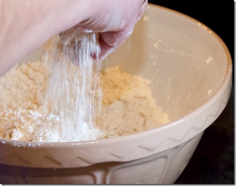
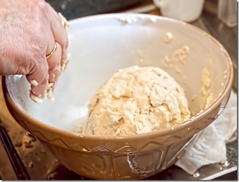
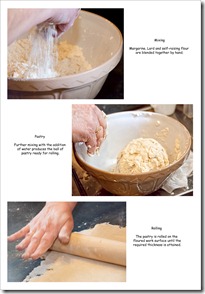
exercise 5.01.01 Mixing
Mixing
Margarine, Lard and self-raising flour are blended together by hand.

exercise 5.01.02 Kneaded
Pastry
Further mixing with the addition of water produces the ball of pastry ready for rolling.

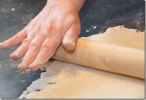
exercise 5.01.03 rolling
Rolling
The pastry is rolled on the floured work surface until the required thickness is attained.

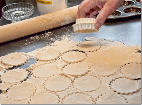
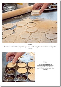
exercise 5.01.04 cutting
Cutting
The cutter is used to cut the pastry into the pie base shapes. Reversing the cutter creates smaller shapes for the lids.

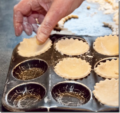
exercise 5.01.05 traying
Shaping
The pie cases are shaped by pressing them into the baking tray. This tray is a favourite which has seen a lot of action but makes very fine pies!

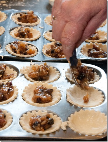
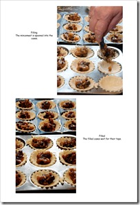
exercise 5.01.06 filling
Filling
The mincemeat is spooned into the cases.

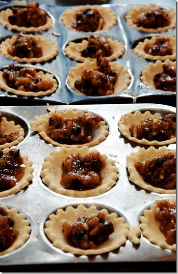
exercise 5.01.07 filled
Filled
The filled cases wait for their tops.

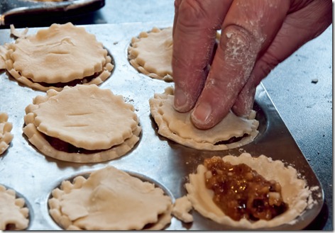
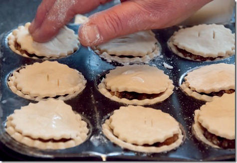
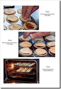
exercise 5.01.08 capping
Capping
The lids are pressed onto the filled cases.

exercise 5.01.09 milking
Glazing
Milk is sprinkled onto the lids to form a glaze.

exercise 5.01.10 shelved
Cooking
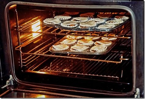
The pies are placed into the pre-heated oven

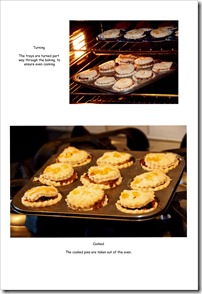
exercise 5.01.11 turning
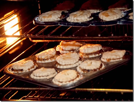
Turning
The trays are turned part way through the baking, to ensure even cooking

exercise 5.01.12 cooked
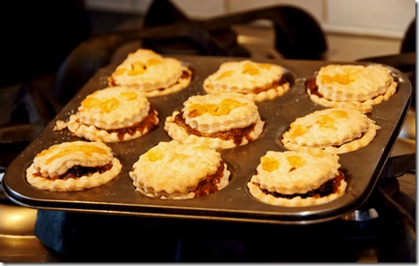
Cooked
The cooked pies are taken out of the oven.

exercise 5.01.13 lifting
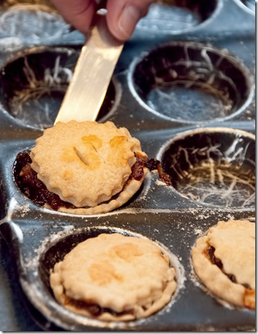
Lifting out
A blunt knife is used to help lift the cooked pies from the tray.

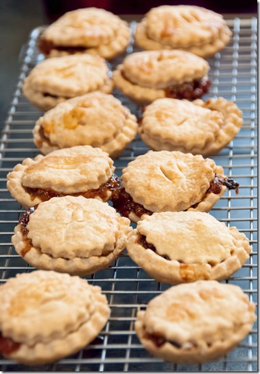
exercise 5.01.14 cooling
Cooling
The pies now stand on the wire cooling rack until they are cool enough to store.

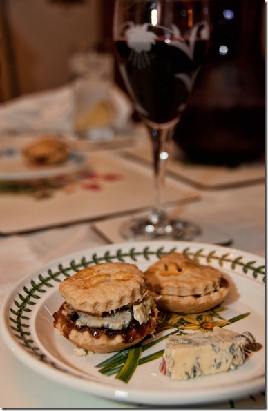
exercise 5.01.15 testing
Testing
This is the most important part of the process – quality control demands a rigorous testing regime, where the pie is reheated, the lid briefly removed and blue cheese (in this case ‘blackstick’) is placed inside. The cheese needs to be on the point of melting for best results and works well with a good Malbec!

The following 7 images show how the narrative is displayed in the pages of the learning log – the blog isn’t very user friendly when it comes to presentation!

Exercise 5.01 Page 01  Exercise 5.01 Page 02
Exercise 5.01 Page 03  Exercise 5.01 Page 04
Exercise 5.01 Page 05  Exercise 5.01 Page 06

It’s been a fun and very tasty exercise!

Friday 2 December 2011

Putting the subject first

Two images I’ve chosen from my collection for comparison between subject and treatment are as follows:

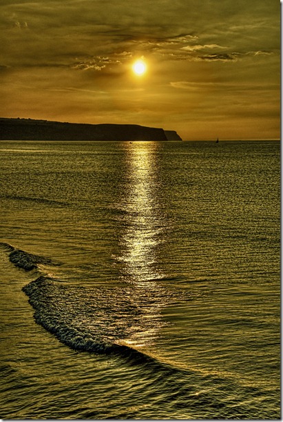
01 Whitby Sunset

Whitby Sunset

I took this image for the light. The colour of the sky, the lazy waves and the line of reflected light from the sun really appealed. The boats and the aerial effect of the headlands were a real bonus. So this image was taken for the overall effect, not a specific subject.

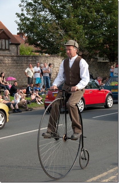
02 Penny Farthing

Penny Farthing

Obviously this was taken for the subject – the Penny Farthing – I’ve never used this one, because it’s so badly taken. The spectators and vehicles in the background really spoil it. The rider doesn’t seem to be enjoying the ride. The double yellow road markings also detract. Not an image to show off!

So taking an image purely for the subject needs more attention than has been given to the ‘Penny Farthing’. The sunset image holds its own without a specific subject, as more care has been taken in its composition. I’ll hope to reach a more acceptable standard during this section.

Part 5 - Narrative and Illustration