Steve's Progress with OCA

This blog is for the learning log for Steve Estill's progress in the study for the BA in Photography with OCA.

The first Module was Photography 1 - The Art Of Photography.
The second module was Photography 1 - Digital Photographic Practice - started in January 2012 and finished in May
For the third module see the new blog at http://moreocapnp.blogspot.co.uk/

Friday 30 March 2012

Assignment 3 – Monochrome

The theme for this assignment is ‘daffodils’. I believe that they will suit monochrome photography, because of their shapes, tonal contrast and texture. They should be interesting to adjust in the processing stage.
Many of the images were taken in our garden (I think we must be close to having the national collection here) with some taken indoors for the close-up macro photographs. Images of wild daffodils were captured at Farndale in the North Yorkshire Moors National Park.
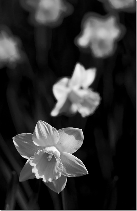
The first image was taken using 150 mm f/2.8 macro lens, f/5.0 at 1/2000 sec which was underexposed by one stop, to prevent highlight clipping.
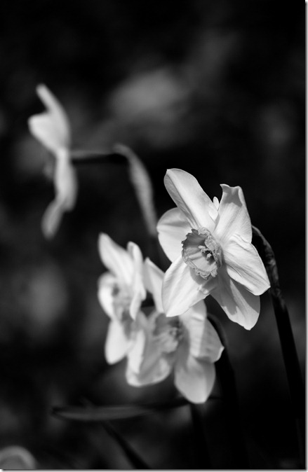
Assignment 3.01
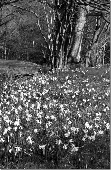
Narcissi receding
This standard yellow daffodil, taken in strong early morning light displays texture and shape with flowers receding in the background. With increased yellow to bring out the flowers and decreased green to darken the grass / leaves; Blue and red were adjusted to give more texture.
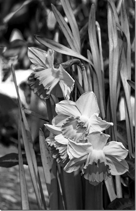
Assignment 3.02
Pink rimmed trumpets
150 mm macro lens, f/22 1/160 sec – underexposed one stop to prevent highlight clipping. Smaller aperture used, to keep the flowers in focus and give more detail.
Assignment 3.03
Red rimmed yellow trumpets on white petals.
150 mm macro lens, f/2.8 1/8000 sec – underexposed one stop to prevent highlight clipping.
Wide aperture for short depth of field.
Assignment 3.04
Yellow trumpets after rain.
18 - 200 mm VR lens at 200 mm, f/8.0 1/160 sec
A curves layer was used to increase the midtone contrast. Darkening the greens and making the yellows lighter further increased the contrast. Adjusting the cyan and blue accentuated the water droplets
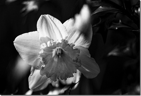
Assignment 3.05
Yellow trumpet on white petals
150 mm macro lens, f/2.8 1/6400 sec – underexposed one stop to prevent highlight clipping.
The narrow depth of field was used to make the leaves of the holly out of focus as this backlit flower looked out from the bush. Yellow was increased and green decreased to increase the contrast of this image.
We now move to Farndale, to see the wild daffodils.
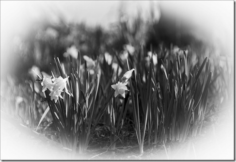
Assignment 3.06
A jocund company
18 - 200 mm VR lens at 170 mm, f/5.6, 1/640 sec
Adjustments were made to the yellow and greens to increase the contrast. The white vignette was given in Lightroom’s Raw editor.
Assignment 3.07
Dancing in the breeze
18 - 200 mm VR lens at 65 mm, f/13, 1/320 sec. One stop under exposed to reduce highlight clipping and increase shutter speed – a breeze was picking up, so a higher shutter speed reduced some of the blur due to movement.
Exposure was increased by 0.71. A curves layer was used to increase the mid-tone contrast. Yellow and red channels were increased and the green decreased. This improved the ‘depth’ in the image.
Assignment 3.08
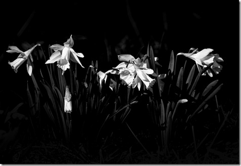
Low Key
18 - 200 mm VR lens at 95 mm, f/8.0, 1/640 sec. Underexposed one stop.
These sunlit wild flowers were taken against a backdrop of a stream in the shade, with the intention of capturing a low key image. In Adobe Raw the effect was further increased by painting the over exposure in the foreground.
Yellow and Red channels were increased and the green decreased.
Moving back home again I’m going to try for high key images, using the macro lens again.
Assignment 3.09
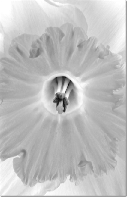
Low Key
150 mm macro lens, f/22, 2 sec
This image was captured in the shade with natural backlighting. The delicacy of the outer trumpet contrasts with the strength of stigma and stamen at the centre.
The trumpet is a very pale yellow while the main petals are white. The centre ring is a stronger yellow which was made brighter by increasing the yellow channel in the B&W adjustment layer.
Assignment 3.10
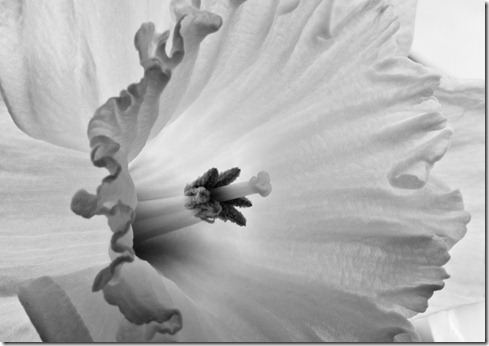
Stigma and Stamen
150 mm macro lens, f/22, 0.8 sec
This macro image was taken with a stronger backlight. It was made more contrasty using curves and adjustments made in channel mixer, rather than the B&W adjustment layer, resulting in a softer merging of the yellow / green of the trumpet centre.
 
All in all it’s been an enjoyable assignment that I’ve got a lot from.
Thursday 29 March 2012

Evaluation:

In this section I’ve reinforced my opinions regarding RAW files over JPEG. The advantages in using Raw over jpeg images far outweigh the disadvantages.
This has been further reinforced in the colour optimization and colour management section.
Generally I’d say that the raw image was more versatile, particularly with the use of the brushes in the Raw editor, and consistently produces a better result. Much better control is available for image adjustments.
Interpretive processing is something I’ve been involved with in my ‘creative’ groups within the PSA. The PSA description of creative is ‘altered reality’ and this type of processing lends itself to it.
I’ve enjoyed the Black and White section of this part. It’s been made more evident what makes a good Black and White image. Revisiting the techniques has been good for me, even considering those that I did in my darkroom. These techniques also apply to the ‘colour to tone’ section which I’ve appreciated too.

Wednesday 28 March 2012

Reference material used in this section:

Books:
Perfect Exposure – Michael Freeman.
ISBN: 978-1-905814-46-6
Langford’s Basic Photography – Michael Langford, Anna Fox and Richard Sawdon Smith
ISBN: 978-0-240-52168-8
Digital photography expert – Black and White – Michael Freeman
ISBN: 1-904705-57-X
Step-by-step / 005 / digital black and white photography – John Beardsworth
ISBN: 1-904705-52-9
Websites:
http://www.northlight-images.co.uk/digital_black_white.html
http://www.darknessandlight.co.uk/black_white_photography_tips.html
http://www.illustratedphotography.com/photography-tips/black-and-white-tips

Exhibition:
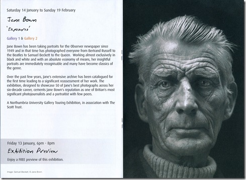
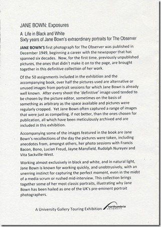
I attended the Jane Bown ‘Exposures’ exhibition at the Durham Light Infantry museum and gallery. It was an excellent exhibition of Black and White photographs – all taken using natural light. Well worth seeing.
Jane Brown exh
Jane Brown exh 1

Tuesday 27 March 2012

Studied artists:

Bernd and Hilla Becher:
Their easily identifiable presentation style of ‘typology’ makes their collections very attractive. Looking further into their individual images, there is strong use of line and form, which tie the typologies together.
Working in Black and White produced images with fine detail. Their style of ‘frontal symmetry’ make the overall shapes of the architecture almost simple but further examination shows so much detail which makes their collections so interesting to view.
Their photography was obviously used as to record the vanishing industrial architecture, but these record images when put together in their collections become fascinating, creative works of art.
http://www.designboom.com/history/becher.html

Larry Watts
His Black and White photography is all film based, but we can see how these images could have been made using digital enhancement. His high contrast images appeal to me with his use of line and shape. Composition is excellent and the variations achieved which I suspect are from the use of filters, could be equally attained using channel mixer.
http://www.visionlightgallery.com/gallery/category.cfm?SID=1&Category_ID=473

Ansel Adams
His photographs were predominantly high contrast images which showed off the light.
He appreciated the changing nature of light and its effects on the landscape and developed a zoning system for the different qualities of light for use in composing an image. In this system, he took light measurements of the significant areas in a scene – these were correlated with exposure and developing criteria to determine the whole range of tones which would be seen in the final print, taking the guesswork out of the photography.
http://www.anseladams.com/ - the Ansel Adams Gallery.

Hiroshi Sugimoto
I enjoyed viewing his site and reading his philosophies and experiments with cameras. I’m not sure I fully agree with some of his propositions – particularly his sense of ‘calming security’ which he associates with the sea. I associate the sea with many different faces and feelings from the calm professed by Sugimoto to total destruction in stormy conditions. I appreciate what he has produced as calm images, using the available light and often long exposures. These obviously translate into digital photography where the techniques (apart from the developing / printing methods) are relevant.
http://www.sugimotohiroshi.com/

Robert Mapplethorpe
The way he used lighting in his images produced images which become real works of art. Some seem to be too dark at first viewing, but these grow on one and the viewer looks further into the detail and form of the subjects. I particularly like many of his flower images which are portrayed in often very subdued lighting and processed to keep the dark.
http://www.mapplethorpe.org/portfolios/

Fay Godwin
Here’s another example of well-produced, well composed images. Her landscapes show that she has a real feeling for the areas – she insisted on taking time to get to know an area before taking photographs and sometimes spent days waiting for the right conditions to occur. Again, it’s something we can learn in our search for the best images.
http://www.djclark.com/godwin/index.htm

John Davies
I was unable to browse his book ‘A green and pleasant land’ other than by a video at http://photobookstore.co.uk/photobook-a-green-and-pleasant-land.html but having seen this, the majority of images in the book can be seen in the image gallery of his website:
http://www.johndavies.uk.com/ His work as a documentary photographer is outstanding. He faithfully records the changing face of industrialised areas, often with contrasts in architecture and social standards, as well as capturing stunning landscapes of the Lake District. His powerful images are so well composed and often tell a story or make a statement of cultural differences. Working in predominantly black and white, his use of this media really suits his photographic style.

Chris Killip
He is a renowned documentary photographer, working primarily in black and white. With ‘In Flagrante’, he has recorded the cultural and social history of the North East following the de-industrialisation of the 80’s. I can relate very easily to his and John Davies’s images of the area – I’ve spent most of my life in the area and I’ve seen and suffered much of the discomfort seen here (I’ve been made redundant as an engineer four times and seen communities degenerate as Chris Killip has recorder). Using Black and White to record this experience is clearly the best medium for the topic.
http://www.chriskillip.com/

Bruce Gilden
His confrontational style has produced a huge body of powerful images that may shock or amuse the viewer. He is obviously very much at ease with his subjects who seem at their ease with him. The work he has produced almost hits the establishment in the eye with what seems to be a complete disregard for what’s ‘nice’. I particularly enjoyed the ‘Fashion Magazine’ essay with its slanted view on the industry.
http://blog.magnumphotos.com/bruce_gilden.html
Robert Adams
He seems to be very much in touch with the soul of a place. His images of the American West, in ‘The place we live’ convey sadness in what we have done to what was once beautiful. It causes some heart-seeking to justify what has been done in the name of progress and to what ends. If an image can convey these feelings then it must have been produced with this in mind, making this documentary powerful in its simplicity.
http://artgallery.yale.edu/adams/landing.php

Irving Penn
I really like the delicate tonal range of the platinum / palladium prints. The range is so much wider (particularly in the mid-range) compared to the usual silver prints. It’s understandable why these prints were favoured. Put the tonal range with the durability of the final print and it would have to be a winner. The price of both platinum and then palladium made the process less popular, but it’s still used occasionally now. It would be well worth looking into how the soft, high tonal range could be reproduced digitally.
http://www.nga.gov/exhibitions/2005/penn/penn_ss1.shtm

Although all the studied photographers worked in film, their techniques and styles could be transferred into digital photography. It’s interesting to see how monochrome suits their individual reporting styles. Their images, in many cases, would not have had the same impact in colour.

Sunday 25 March 2012

Exercise 3.08 – Colours into tone 2

The option I decided to use for this exercise was to use the channels layer to alter the lightness of green foliage.

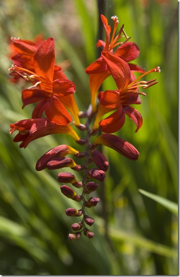
I selected this image of a crocosmia, as I wanted to emphasize the difference in tones for the complementary colours.

Exercise 3.08 01

Original Image

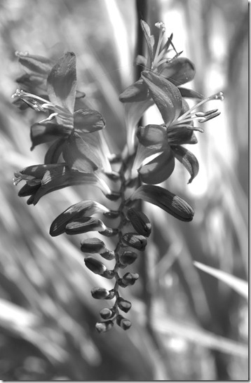
For a reference, I created the following version, by converting to grayscale with no other adjustments:

Exercise 3.08 02 grayscale

This image is now an overall fairly dark grey, with little detail showing in the flower head.

I then converted the original image to monochrome, using the channel mixer:

Exercise 3.08 03

In the channel mixer I increased to green slider significantly, until clipping started to occur. The red channel was decreased slightly, to emphasize the flower petals. The blue channel was increased slightly to improve the highlights in the flower petals, until clipping started to show.

This image now shows much more detail in the flower. By making the background greens lighter and darkening the flower, the image has more contrast and separation of the flower from the foliage.

Friday 16 March 2012

Exercise 3.07 – Colours into tones 1

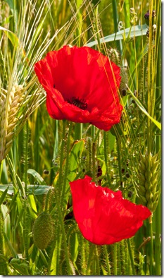
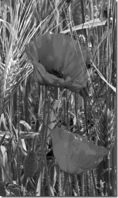
Using an image of poppies in a corn field, for their complementary colours, adjustments to the channel mixer (selected for monochrome) were made:

Exercise 3.07 01      Exercise 3.07 02 grayscale

Original Image                                    Grayscale Image

The grayscale image was obtained by selecting the grayscale mode, rather than the channel mixer, to attain a reference image for the next two adjustments.

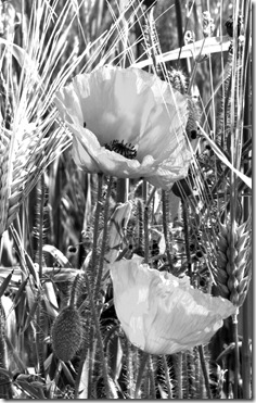
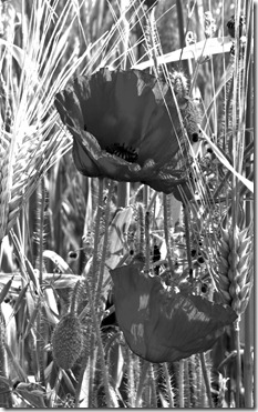
Exercise 3.07 03 red     Exercise 3.07 04 green

Red slider 100%                                    Green Slider 100%

With the red slider at 100%, the poppy petals became almost white, as expected. Other elements in the image also became much lighter. Obviously the corn and the poppy stem hairs have an element of red in them, as they became lighter. Some of the greener parts (long stems and poppy seed heads) became darker.

With the Green slider at 100%, the green parts became lighter, as did other areas in the image – the corn obviously has some green elements, but surprisingly much of what was perceived to be green didn’t get as light as I’d expected. I assume these areas must have an element of yellow (which would be affected by the blue slider). What does surprise me is the darkness in the red poppy petals. The flowers have become more prominent in the image, due to their contrast with the lighter foliage.

It’s worth noting that the majority of foliage has become very light in both situations, to the point of clipping, so these adjustments require some care when making them. Personally I prefer to use the B&W adjustment layer to create monochrome images – it’s easy to see the effect on the final image and is much more controllable.

Exercise 3.06 – Strength of interpretation

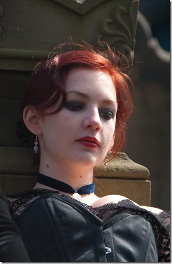
The first image I selected for this exercise was taken in St Mary’s Graveyard during the Goth festival. I feel that this image will suit a high contrast approach, even though there will be clipping in both highlights and shadows.

Exercise 3.06 01

Resting Goth

200 mm, 1/160 sec, f/6.3

I converted the Raw file to Tiff without any alterations to the original settings, then opened it in Photoshop.

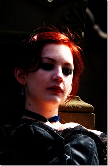
In Photoshop I used a threshold adjustment layer to set the black and white points, then a curves adjustment layer with a very steep mid curve to create the high contrast colour image below:

Exercise 3.06 02

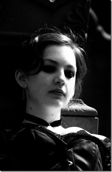
Some of the detail has been lost here and there’s obviously a significant amount of clipping. I’m not really taken with this version, but taking it into Black and White has a lot more potential. For this step I used the B&W adjustment layer.

Exercise 3.06 03

This version now works very well for me. There’s an entirely different feel to the image. What was an entertaining image has now become one portraying despair and loss.

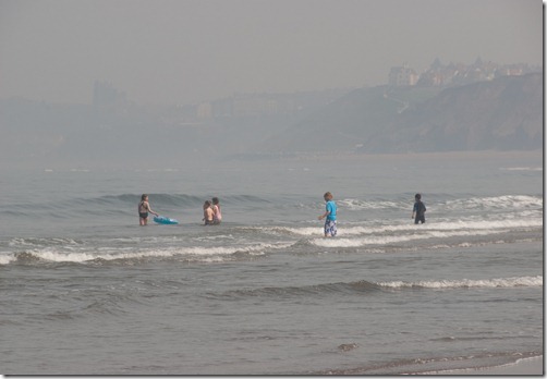
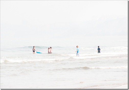
For the second image I’ve chosen one of children playing in the sea. I considered this a good candidate for ‘high key’ treatment.

Exercise 3.06 04

Water babes

This was a very hazy day, so a lot of the background was very light before any adjustments. I converted the Raw file in Lightroom, increasing the exposure so that the background faded to white, then using the adjustment brush to lighten the foreground.

Exercise 3.06 05

This treatment certainly makes the water look more appealing. The remit was to lighten the whole image – I’d have been tempted to increase the contrast around the children to further enhance this image.

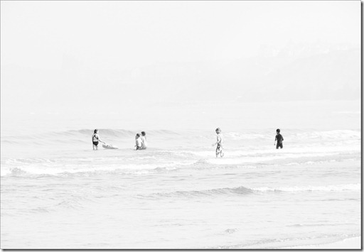
Taking the image into Black and White, using the Photoshop B&W adjustment layer has produced a more pleasing result, but I think the colour version could be better with that extra adjustment.

Exercise 3.06 06

I think this image works because of the horizontal line of children which stands out in the light background.

Exercise 3.05 – Black-and-white

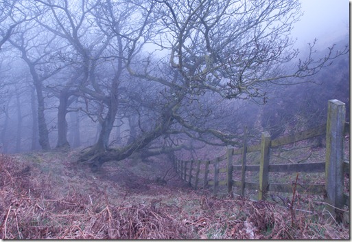
The hill fog made this image feasible. For a long time I’ve known about these trees and how good they could look in the right conditions. Hill fog is often too wet to work in, but over the last couple of days we’ve had fog with quite dry conditions, so I was able to risk climbing down to capture this image.

I was sure it would work best in Black and White, particularly in foggy conditions when colours are muted anyway. The mist also gives a kind of aerial perspective (over a short distance) which gives an impression of depth. I wanted to use the wooden fence as a lead in to the scene and to give another impression of depth in the image. In fact there’s a physical depth to this image, as the ground falls away very sharply.

Exercise 3.05 01

20 mm, 1/20 sec, f/22.

This original image is quite flat. I composed it to use the fence as the lead in to the central tree, while keeping the hazy trees in frame. The branches closest to the camera would be much darker than those in the distance. The depth of colour in the bracken and sky will be similar and can be made much lighter in the black and white conversion.

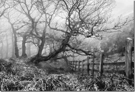
Exercise 3.05 02

The image was first made more contrasty, using ‘levels’ and ‘curves’ adjustment layers, then a Black-and-white adjustment layer, where the sliders were adjusted to get this image.

I feel that this Black-and-white version works so much better than the colour version. It’s a much more powerful image than could have been expected from the colour version.

The elements of contrast, line and volume are used in the scene.

I got the image I set out to capture.

Wednesday 14 March 2012

Exercise 3.04 – Interpretive processing

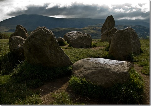
For this exercise I’ve used an image of the sanctuary in Castlerigg stone circle. The original Raw image was quite flat, due to the overcast weather conditions.
The first image is the first conversion to Tiff, using Adobe Raw within Photoshop. I reduced the exposure by 1.05 stops, increased the recovery by +95, increased the contrast to +40 and slightly reduced the clarity to -5.
Exercise 3.04 01 Castlerigg sanctuary
I felt this treatment recorded the feeling of the place.
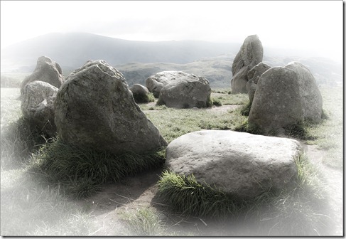
I wanted to create an image that portrayed a mysticism, so I processed the image again – this time using Lightroom.
I increased the exposure by 0.25 stops, brightness to +76 and contrast to maximum. Clarity was reduced to -49, vibrance to -65 and saturation to -27. These settings created a fairly high key image with significantly reduced colour – I didn’t want completely monochrome as I felt this would detract from the ‘mystical’ quality I was looking for.
To further polarize the sanctuary I wanted to reduce the impact of the surrounding landscape, so I used a white vignette – again from Lightroom.
Exercise 3.04 02 Castlerigg mystical
Further additions could be made – a light on the centre stone, or an imported Druid, but I think this image does what I wanted.
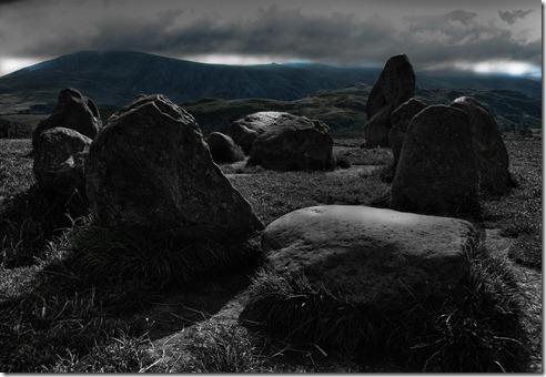
For the third image I wanted to create a dark, foreboding feeling.
I opened the first image in Photoshop, duplicated the layer and treated it with Topaz Labs Adjust 5 plug in, in Charcoal sketch mode. I used ‘soft light’ blending mode (90% opacity) over the original layer, then stamped up the layers (Layer 1).
The burn tool was used to darken the sky in layer 1
A B&W adjustment layer was used to convert the image to monochrome and the layers again stamped up (Layer 2)
Layer 2 was placed in ‘lighten’ blending mode over Layer 1, then the image flattened.
Exercise 3.04 03 Castlerigg foreboding
This doesn’t look like a place you’d want to stay in for very long. A place where dark things may happen! Again, I retained some of the colour, but this time much darker.
I think I achieved my ideas in each of the images. I’m sure that they could each be further enhanced, but I’m happy with the results I obtained.

Project – Creative interpretation

Tuesday 13 March 2012

Exercise 3.03 – Managing colour

Correction of colour casts is addressed in this exercise. Each image was taken in Raw with a high resolution jpeg copy. Obviously the jpeg file has had some ‘in-camera’ adjustments. Prior to correcting any of these images, my monitor was recalibrated, using a Gretag Macbeth Eye One, Display 2 calibrator

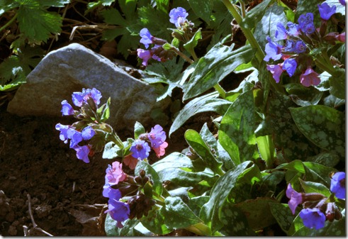
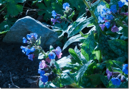
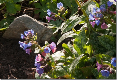
The first image was taken in our garden on a bright sunny day, but with the White Balance set for incandescent lighting to create the colour cast.

Exercise 3.03 01 jpeg

This jpeg image has a distinctly blue cast. The stone is a mid grey which will be used for reference.

Correction of this cast was done in a single stroke, using the ‘grey dropper’ tool accessed from a ‘Levels’ adjustment layer. Selecting the shadow area of the grey stone produced this correction:

Exercise 3.03 02 jpeg

No other adjustments were needed, as this is a good representation of the perceived colours on the day.

The Raw file was corrected for maximum dynamic range and saved as a tiff, as below:

Exercise 3.03 03 raw

In Adobe Raw, within Photoshop, the temperature was increased from 2950oK to 5500oK. Highlight recovery was increased and the blacks decreased to remove Highlight and Shadows Clipping. Clarity and Vibrance were increased. The resulting image was as below:

Exercise 3.03 04 raw

The raw file again provides a more controllable method of correction, but it obviously takes longer.

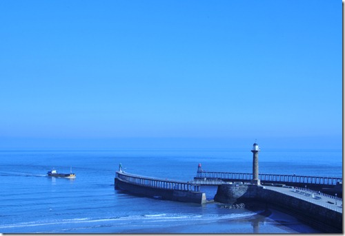
The second image was taken on a bright slightly hazy day with the White Balance again set for incandescent light. The jpeg image was as below:

Exercise 3.03 05 jpeg

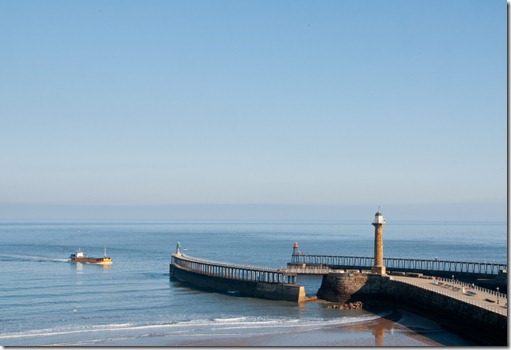
The sky and sea, with the cast due to the white balance have made this image very blue indeed.

I had intended to use the concrete of the top of the pier as a reference point for the ‘grey dropper’ tool, but the correction didn’t work as well as the previous image – probably due to the sandy colour of the concrete – so a selective colour layer was used to further correct the cast:

Exercise 3.03 06 jpeg

This was an improvement, but still not to my satisfaction.

With the Raw image I had more chance of success:

Exercise 3.03 07 raw

Again, there’s a very blue cast to correct. In Adobe Raw I increased the Colour temperature from 2950 oK to 5300 oK, which improved the image considerably. I also increased the Highlight recovery, the Blacks, Contrast, Clarity and Vibrance. The Raw file was then saved as a Tiff file. A selective colour adjustment layer was used to further enhance the Red, Yellow and Green colours in the image, to produce the image below:

Exercise 3.03 08 raw

I’m much happier with the colours shown here, which are much closer to those seen at the time.

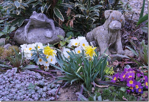
The third image was again captured in our garden. Taken on a very cloudy day with the White Balance set for fluorescent lighting to create a colour cast:

Exercise 3.03 09 jpeg

This image has a colour cast which is not as severe as the previous two, but it still needs some modification. The base of the concrete frog was used as target for the ‘grey dropper’ tool, which produced the following correction:

Exercise 3.03 10 jpeg

The colours in this image are very close to those seen at the time.

Using the Raw image, I decided to try to make the image look warmer than the above.

Exercise 3.03 11 raw

The above Raw image was opened in Adobe Raw and the colour temperature increased from 3950 oK to 4400 oK. Highlight recovery, Clarity, Vibrance and Saturation were increased and the image saved as a Tiff. A selective colour adjustment layer was then used to produce the ‘warmer’ tones below:

Exercise 3.03 12 raw

In this image you’d almost think the sun was breaking through!

So again, Raw files are much more controllable and generally produce better results than those available from jpeg files.

Exercise 3.02 – Managing tone

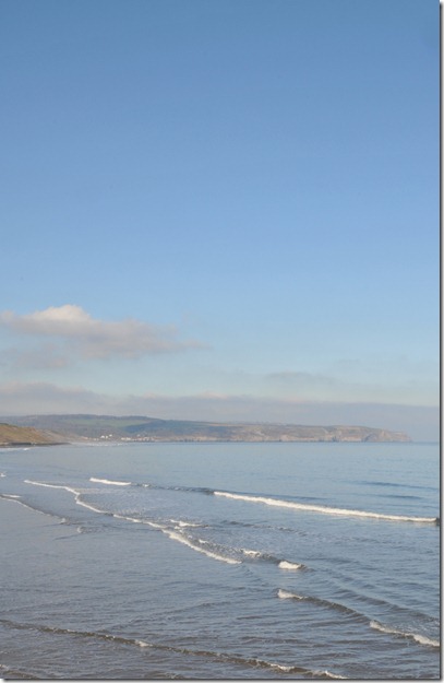
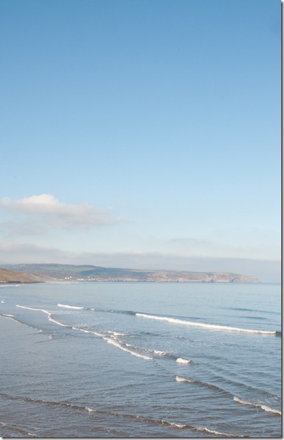
The image used for this exercise was taken on a slightly hazy but almost cloudless morning. Shooting away from the sun, to minimize shadows and increase the colour, I produced this low dynamic range, very flat image:

Exercise 3.02 01 jpeg

This jpeg image was opened in Photoshop where the exposure was reduced by one stop.

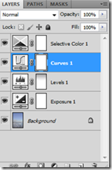
Using a ‘Levels’ adjustment layer with the Alt key depressed, the input black slider was moved to the right until the first indication of black was seen (at the curl of one of the waves).

Still with the Alt key depressed, the white slider was moved to the left until the first highlight clipping was seen (on a breaking wave).

This caused the blue sky to become too strong, so a black / white gradient was used in the layer mask with opacity of 40%, running from the top of the image to the first of the clouds. This reduced the effect of the levels adjustment layer.

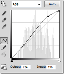
A curves adjustment layer was then used to increase the mid-tone contrast, by creating an ‘S’ curve to lighten the highlight areas while holding back the darker parts:

image       image

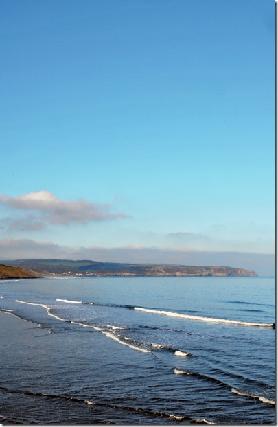
A selective colour adjustment layer was then used to lighten the cyan and blue colours.

Exercise 3.02 02 jpeg

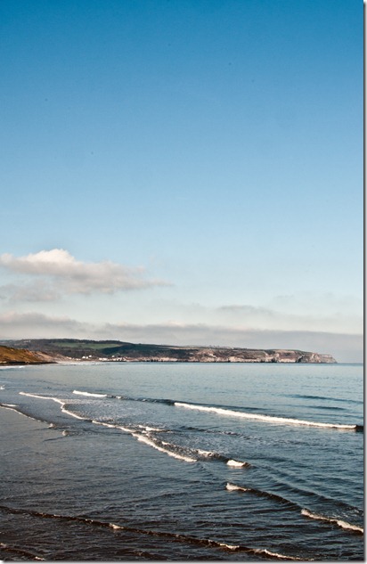
The raw image was then opened in The Adobe Raw editor in Photoshop.

Exercise 3.02 03 raw

The exposure and black sliders were increased until shadows and highlight clipping was seen. This also altered the colour balance, so the White Balance was adjusted, to reduce the impact of the strong sky. The clarity and contrast sliders were also used – this altered the highlight and shadow clipping, so the exposure / black sliders required more adjustment.

The brush tool was used to overexpose the now very dark sky and again to under expose and increase the clarity on the headland and village.

Exercise 3.02 04 raw

Generally I’d say that the raw image was more versatile, particularly with the use of the brushes in the Raw editor, and has produced a slightly better result. Much better control is available for image adjustments.

I’d make further colour adjustments in Photoshop proper, using a selective colour adjustment layer, but this exercise is aimed at the ‘tone’ control rather than ‘colour’.

Project – Optimising tone and colour

Wednesday 7 March 2012

Exercise 3.01 – Raw

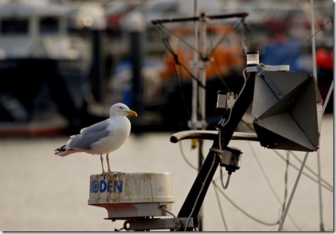
The first image – daylight – was taken at the harbour.

440 mm, f/10, 1/160 sec

Exercise 3.01 01 raw

Adjustments made to the Raw image in Lightroom 3 were:

Exposure + 0.69

Highlight recovery + 22

Black Clipping +9 (to 14 from default of 5)

Clarity +52

Vibrance +49

White Balance Temperature + 253 to 5103

The local adjustment brush was used to darken the background, so accentuating the gull.

Exercise 3.01 02 jpeg

Adjustments made to the jpeg image in Lightroom 3 were:

Exposure + 0.32

Highlight recovery + 16

Fill light +7

Black Clipping +8

Clarity +22

Vibrance +10

White Balance Temperature +13 – Actual final temperature was not available.

It can be seen that adjustments in the Raw image were much higher than in the jpeg image for a similar result, so the adjustments in the Raw file are much more controllable. The colours in the Raw file look much more natural – the automatic in camera adjustments for the jpeg image have flattened the image slightly.

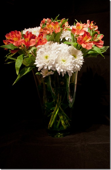
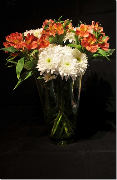
The second image – artificial light – was taken in my study, using overhead halogen spotlamps

28 mm, f/7.1, 1/5 sec

Exercise 3.01 03 raw

Adjustments made on the Raw image in Lightroom 3 were:

Exposure + 0.05

Highlight recovery +32

Clarity + 84

Saturation +3

The local adjustment brush was used, to select the vase and increase the exposure, contrast and clarity in that area.

The local adjustment brush was then used to select the white flowers and reduce the exposure and increase the clarity, saturation and contrast in that area – this was to show more detail in the flower petals.

Exercise 3.01 04 jpeg

Adjustments made to the jpeg file, also in Lightroom 3 were:

Clarity +68

Highlight recovery +43

The local adjustment brush was used to select the white flowers and decrease the exposure in that area.

Again, the adjustments to the Raw image required bigger steps, but that makes finer adjustments easier.

I was happy with the automatic white balance in the Raw image. That in the jpeg seemed slightly warm, but not too much.

There must have been some sharpening with the in-camera jpeg conversion as the petals of the white flowers in the jpeg image required less adjustment than the Raw file.

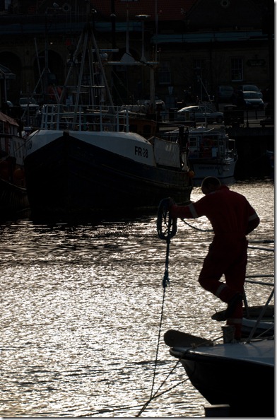
The final image – high dynamic range - was again taken in the harbour

175 mm, f/10, 1/500 sec

Exercise 3.01 05 raw

Adjustments made on the Raw image in Lightroom 3 were:

Exposure + 0.14

Highlight recovery +32

Clarity + 56

Vibrance +26

The local adjustment brush was used, to select the blue scaffolding lines above the station and darken them so they weren’t so prominent.

Exercise 3.01 06 jpeg

Adjustments made on the jpeg image in Lightroom 3 were:

Exposure -0.51

Highlight recovery +11

Black Clipping +3

Clarity + 40

Vibrance +40

The local adjustment brush was used, to select the blue scaffolding lines above the station and darken them so they weren’t so prominent.

The automatic White Balance worked well for this image. Both images work well, but I feel there’s more control in the highlight areas with Raw.

A more noticeable difference was noted when looking at the shadow areas in the two formats.

Exercise 3.01 07 raw     Exercise 3.01 08 jpeg

Both of these images have had their exposure increased by 3 stops, using Lightroom. The Raw image on the left can still bring out the colours and details across the whole range. The jpeg image on the right has lost all the detail in these shadow areas – it seems therefore that there’s a loss of data in the conversion.

We’ve seen advantages in using Raw over jpeg images.

· There’s no loss of data from the camera.

· The available amount of exposure compensation is far greater.

· The accuracy of any changes to the various parameters is far greater – so lots more control over how the image looks.

· Processing on the computer, rather than the camera means that there is more scope to produce the image required.

· Colours appear to be more accurate.

· White balance can be more easily and accurately changed.

· No loss due to sharpening

There are some disadvantages:

· It must be further processed and saved in another format before any print can be made.

· The files are much bigger – so more storage required.

· It takes more time and perseverance to create the final image.

Consider also the artefacts which may occur in jpeg images and the fact that further processing and saving as jpeg creates another loss of data.

Overall, I’m still convinced that Raw is the best way to take images – jpegs have their place, but I prefer to stay with Raw.