Steve's Progress with OCA

This blog is for the learning log for Steve Estill's progress in the study for the BA in Photography with OCA.

The first Module was Photography 1 - The Art Of Photography.
The second module was Photography 1 - Digital Photographic Practice - started in January 2012 and finished in May
For the third module see the new blog at http://moreocapnp.blogspot.co.uk/

Saturday 28 April 2012

Exercise 5.01 – Sharpening for print

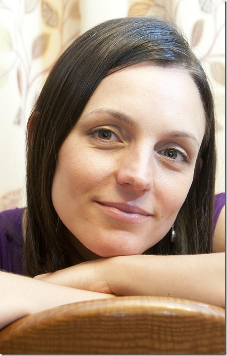
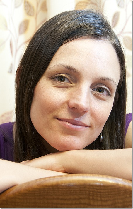
Revisiting the portraits taken for Part 1, I used an image that had not been used in the exercise.

The original image is shown without any sharpening:

Exercise 5.01 01

With the image zoomed in to 100%, I used the ‘unsharp mask’ to vary the amount of sharpening as follows:

First copy settings:

Amount 42%

Radius 4.0 pixels – OK because of the high image resolution.

Threshold 2 levels – applied to minimize sharpening in smooth areas.

Exercise 5.01 02

At these settings there was little difference to be seen on the screen.

Second copy settings: Amount 100%

Radius 4.0 pixels

Threshold 2 levels

Exercise 5.01 03

The highlights in her face are now becoming too light for me and her hair isn’t as soft as I’d like to see it.

Third copy settings: Amount 200%

Radius 4.0 pixels

Threshold 2 levels

Exercise 5.01 04

Even with this media and size, artefacts are clearly visible. The smoothness of her skin has disappeared and her eyes / eyelids have become rougher.

The tif images for printing were saved at 300 dpi at full size. With the images at 100% they were cropped to allow printing at A4 – using Fotospeed EG Platinum Matt paper on the Epson printer. I chose this paper because of its smooth, flat finish – no texture to influence the look of the print.

The images were then viewed on the screen at 100% zoom to compare the prints at the same size. A daylight lamp was used, to view both the screen and the prints. A magnifying glass was used to examine the prints more closely.

On the first image the print and viewed image were both clear, with the smooth skin areas looking just that. The print showed no sign of additional artefacts.

On the second image (42% sharpened) the print and screen images were still clear – both have slightly more clarity in the eyes. On close examination the print is showing a slight breakdown in the shadow areas (skin around the eyebrows and in the shadows by her hair) but they still look quite acceptable to me.

At 100% sharpened the highlights in eye pupils are much more pronounced, making them appear brighter and sharper, but the artefacts are increased, again in the shadow areas. The edge sharpness is more pronounced – more on the print than on screen, so her chin line now looks more angular. The sharpening has had a detrimental effect on the hair, making the individual strands more visible, which makes it look harsher than the first image. So on balance I’d say this level of sharpening is too much for this image.

At 200% the artefacts are more visible on both print and screen images, across the lighter areas. It now looks as though her eye makeup has been plastered on, whereas in the first image it’s hardly visible. Every slight blemish and follicle now stands out, making the originally soft features look hard. Her chin has now acquired a lighter outline, making it even more exaggerated than the previous image. The edge sharpness is now unacceptably high and her clean hair now looks lank. The print looks slightly better than the screen image, but not much.

I think the prints may be generally more forgiving than the screen when it comes to artefacts (to a degree) – the action of the bubble jet heads may tend to merge some of the pixels, so artefacts will not be so pronounced – this is more prevalent with matt papers increasing with textured ones. It seems that sharpening between 42% and 100% would be acceptable to me, for this image and at this radius and with this printer / paper. The larger sharpening radius also helps to reduce the effect of artefacts, but the original size of the image needs to be taken into consideration. Obviously more experimentation with trial and error would be required.

Taking the images further we can maintain the smooth skin while sharpening the eyes (just pupils) and lips, by placing the sharpened image over the original and using a layer mask to show only the required parts of the sharpened layer – this way we get the best of both:
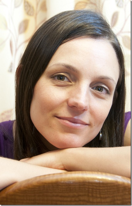
Exercise 5.01 05

Friday 27 April 2012

Project – Finishing

Backups

I always copy images directly to a 1TB external hard drive into a ‘download’ folder with subfolders by date captured.

Also on this ‘Photographs’ drive I have an ‘in progress’ folder, which is where I have all the images I’m working on – also with subfolders – e.g. OCA. All ongoing work done in Photoshop, Lightroom, On-one etc is saved there, rather than on the main PC.

The ‘Print’ folder on the external drive contains all the finished, flattened images again in subfolders – e.g. OCA > DPP > Part 3.

Doing it this way, I always have my images separate from the main computer hard drives.

I also have another 1 TB external hard drive – Photographs Backup – Every fortnight I format this drive and copy the whole of the contents of the ‘Photographs’ drive. So this gives me a complete backup of all my images should the ‘photographs’ drive fail – at worst I’ll have only lost images from the previous fortnight.

My third external hard drive – 2 TB ‘Backup’ – is used to back up my main computer once a week, so saving everything I have worked on, including Lightroom catalogue and any images located for easy access in learning logs / blogs etc.

So I think I’ve got the backup system pretty well boxed off – I had to use it last month, as my PC hard drive broke down. I was so pleased that it was in place – transferring it to a new machine saved me days of hardship. I’m not too concerned about saving documents remotely – if the house were to burn down, I’d have more pressing things to worry about and I can always take more images.

Prints:

I have a 24 in Dell monitor which I calibrate at least every 4 weeks, using a Gretag Macbeth eye-one display 2 calibrator. This is set up for a 4 weeks reminder, but if there is a significant change in lighting conditions I recalibrate it anyway.

I have two A3+ printers – Canon i9950 and Epson Stylus Photo R2880 – using a variety of papers – Olmec, Fotospeed, Hahnemϋhle, Ilford Galerie, Harman. I create ICC profiles for the individual papers for each printer using a datacolour Spyder 3 print calibrator.

I feel that my prints generally have a good resemblance to what I see on the screen.

Part 5–The final image

Tuesday 24 April 2012

Assignment 4 – Real or fake

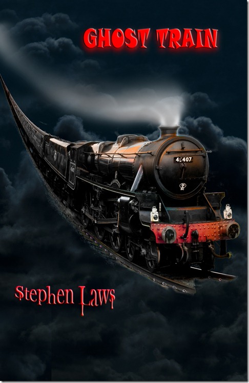
I decided to make an illustration for Stephen Laws’ ‘Ghost Train’. I envisaged a flying train in a very dark sky.

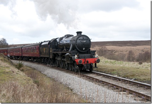
For this I took two images – the first being a steaming train on the moors railway (f/7.1 at 1/400 sec – shutter priority mode for a relatively fast shutter speed)

01 train

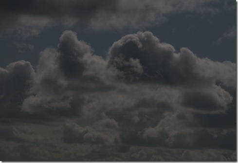
and the second being a turbulent cloudy sky (underexposed 2 stops at f/25. 1/1600 sec).

02 sky

On the sky image I adjusted the Raw image, increasing the exposure by 0.55, decreasing the white balance temperature to 4300 oK, increasing the blacks (22%), highlight recovery (30%) and contrast (69%). The layer was duplicated and treated with Topaz Adjust 5 in ‘solarized dreams 2’ mode. This was placed in ‘lighten’ mode. I then stamped up the layers.

I selected the train from its background, using Topaz Remask3 and then detailed erasure using small brushes on the layer mask. Some cloning was necessary to remove foliage from the tracks and rear carriages. The selection was then dragged onto the sky layer.

I duplicated the train layer and used Edit > transform > warp to make the train sweep down from a height. I then duplicated this layer and treated the new layer with Eye Candy 6 – gradient glow, with an orange colour and used ‘Color’ blending mode. The two ‘curved’ train layers were then stamped up after hiding the sky layer. The sky was then made visible again.

The stamped up layer was duplicated and the top layer treated with Redfield fractalius in 50% glow mode. This layer was placed in ‘saturation’ blending mode – I used a layer mask to bring back the detail of the front of the engine.

I wanted to have a portrait orientation for the book cover, so I increased the canvas size by 50%, leaving the train pegged to the centre. This allowed the image to be cropped to the required format. I filled the blank parts of the canvas with sky, using the clone tool on a duplicated layer of the sky. I was aware that this additional area could be used for text.

I then created two blank layers to paint in smoke / steam, using white for the steam on one layer and grey for smoke on the other. I used a large soft brush on both layers and erased the parts not required using a very large soft eraser.

For the author’s name I the horizontal text tool, with ‘Bright red bevel’ style and treated it with Eye Candy 6 ‘Drip’ filter. For the Title text I used the same style with Eye Candy 6 ‘glass’ filter.

The layers were then flattened and saved as tif, Hi res jpeg and lower res jpeg.

Ghost train

The creation of this image went as I expected. I usually experiment with the blending modes as I work through this type of image, so this was always part of the plan. The parts that were added to the original plan were the use of the Eye Candy and Redfield Fractalius plug-ins, as I thought they would enhance the image as it progressed – I’d planned to use Eye Candy for the text. I didn’t think about the orientation of the image until later in the proceedings so the changing of canvas size and cloning of the sky weren’t planned.

Regarding the ethics of this image, I don’t have any problems – it’s a fiction book with a fictional cover – all I’ve done is manipulate and combine images to provide a cover which may stand out in the bookstands.

Discussion, further study and evaluation

Discussion:

The ethics around what should or should not be acceptable in digital imaging processing is an area which is debatable. A purist would say that a photograph should be an exact representation of what was seen at the time of capture. In photojournalism, this may well be the case, but even that would bring into question any alteration to white balance, exposure, cropping etc. This area hasn’t had any significant change since the dawn of photography, as the final prints would be down to the adjustments made in the dark room.

Making alterations to an image so that it has significantly changed brings a completely different debate – is it a hoax or has it been maliciously altered? Generally I would say that if an image has obviously been altered then that’s OK – it should also be acknowledged in any supporting text – but if a significantly altered image is designed to mislead or misguide, then it should not be acceptable. Use of corrections to exposure, gamma and white balance, cropping, conversion to Black and White etc I would consider legitimate photographic techniques to enhance an image.

Douglas W. Cromer addresses some of these issues w.r.t scientific images in his essay:

http://cbe.ivic.ve/ftp/clasebioest/pdf/Digital_Imaging_Ethics.pdf

‘Catching the light’ by Jerry Lodriguss also discusses the ethics in:

http://www.astropix.com/HTML/J_DIGIT/ETHICS.HTM

He says: ‘When we correct, manipulate and enhance images in Photoshop, we must deal with questions of both ethics and aesthetics. This discussion is not only limited to digital manipulation, but also includes conventional darkroom methods.

Ethics are a set of rules that we invent that define what we think is good and bad. The dictionary says ethics are "a set of moral principles or values" and that ethical means "conforming to accepted professional standards of conduct".

Aesthetics, on the other hand, deal with the nature of beauty, art and taste, and things that are pleasing in appearance.

With digital processing, there is almost no limit to what can be done to an image, and many things are done to images with the best intentions. The question is, when does the pursuit of aesthetics violate our ethics?’

So if we consider our photography manipulation to be for ‘aesthetics’ then provided that the manipulation is acknowledged it should be acceptable. And let’s face it – people want entertainment – if a manipulated image appeals to them or elicits some emotion then that’s acceptable to me.

Studied Photographers:

Lee Frost

His use of imaging software brings out the best in his images, whether it be portraiture, landscape or themed. He creates excellent works of art which although obviously enhanced / altered produce images which capture the imagination.

http://www.leefrost.co.uk/default.asp

Paolo Pellegrin

Here’s a photographer whose images are verging on the unacceptable w.r.t photojournalism, but with the right treatment their impact on the viewer justifies the editing. He uses minimal adjustments – mainly for basic conversion (curves, contrast etc) in Lightroom – he was an old-school film photographer and was reluctant to move into digital – source: Digital Camera magazine, Dec 2011.

http://www.magnumphotos.com/C.aspx?VP=XSpecific_MAG.PhotographerDetail_VPage&l1=0&pid=2K7O3R13CHLN&nm=Paolo%20Pellegrin

Books referenced during this section:

The Adobe Photoshop Lightroom 3 Book – Martin Evening

ISBN-13: 978-0-321-68070-9

Adobe Photoshop CS5 for Photographers – Martin Evening, Jeff Schewe

ISBN 978-0-240-81483-4

The A-Z of Creative Digital Photography – Lee Frost

ISBN-13: 978-0-7153-2299-4

Surreal Digital Photography – Barry Huggins and Ian Probert

ISBN 1-904705-41-3

Surreal Digital Photography 2 – Ben Renow-Clarke

ISBN-13 978-1-905814-07-7

The Complete Guide to Digital Photography – Michael Freeman

ISBN-13 978-0-500-54325-2

Digital Photography Special Effects – Michael Freeman

ISBN 0-500-54266-X

Evaluation

I don’t feel that I’ve gained much knowledge from this section. It’s nothing that I haven’t done before. But it’s been fun.

Exercise 4.05 – Alteration

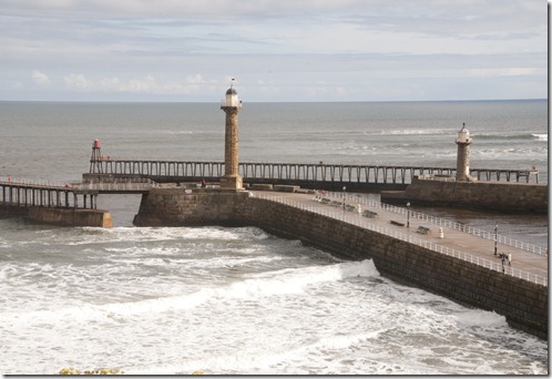
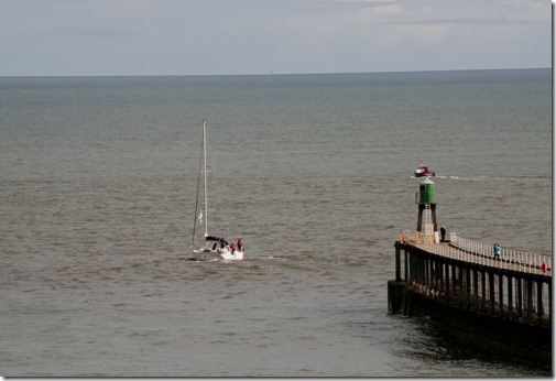
For this exercise I took two images – one of Whitby piers and one of a yacht heading out to sea.

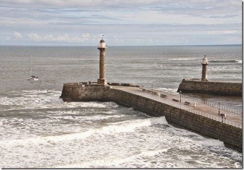
My plan was to remove the pier extensions, to take them back to the original pier length (pre-1913) and place the yacht in the image for some interest and realism – it would also take the focus away from any obvious changes to the piers.

Exercise 4.05 01

Original piers image

I copied the image into a second layer and used this layer for the alterations – this left the original as a reference and recovery tool if required.

The clone tool was the main implement for this task, selecting different parts of the sea to paint out the unwanted parts of the image. Using different sized tools for the more delicate parts and selecting parts from the main image to clone – for instance the waves coming round the side of the West pier were used to create a similar effect on the East pier. I then used a breaking wave from the pier wall, to break over the end of the West pier – also the West pier castellation were copied from parts of the main pier wall.

To clone the areas around the West pier handrails I zoomed in and used a small clone tool with the shift key to create straight cloned lines along the rails.

Where it was difficult to get sharp lines – for instance on the East lighthouse – I used a layer mask to bring back the straight sides of the lighthouse from the lower layer.

Exercise 4.05 02

I selected the yacht using the polygonal lasso tool and dragged it onto the altered image, where I resized it and positioned it where I considered it should be. I used a layer mask to remove the sea from the yacht image as it was a sharper image than that of the pier – again I used the shift command with a small brush to work around the rigging. I left the yacht’s wake in place as much as I could using a lower opacity brush as I worked this part in the layer mask.

I then stamped up the layers and used the blur tool at 50% strength, on the top layer around the yacht – this part of the image was too sharp for the rest of the scene, and some blur blended it in. When I was satisfied with the result I flattened the layers and saved the final image.

Exercise 4.05 03

I don’t have any problem regarding these changes. I set out to make a new image which won’t be used for any serious purpose – it’s just a fun image. I suppose it could be used as a spoof, but that would be obvious.

I think the objective of creating a believable image has been achieved and that’s all that is required.

Exercise 4.04 – Addition

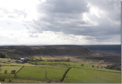
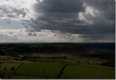
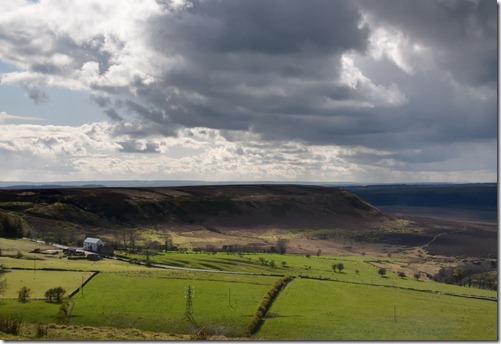
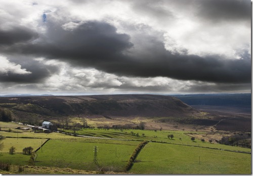
The images taken for this exercise were from the top of Winney Nab, overlooking Wheeldale moor on a day with sunshine and heavy showers, which gave the kind of skies I was looking for and well lit moorland.

The first image was exposed for the land, using one stop underexposure from the matrix metering.

Exercise 4.04 01

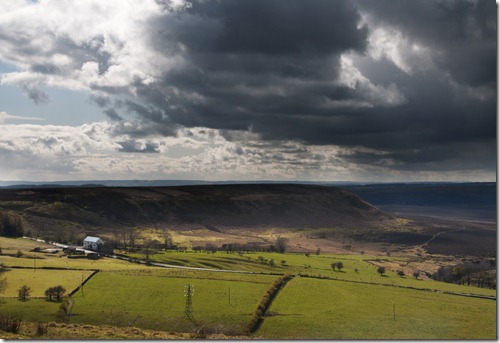
The second image was exposed for the sky, using one stop over exposure from the matrix metering.

Exercise 4.04 02

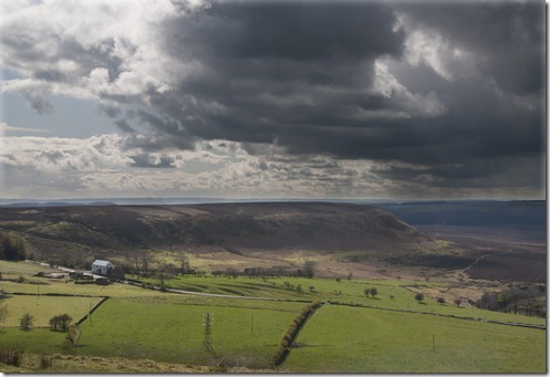
Placing the lighter image over the darker one in Photoshop, I erased the sky area from the lighter image, using a layer mask and a large, soft brush.

This method gave a pleasing blend with the aerial perspective effect in the distance:

Exercise 4.04 03

Using the quick selection tool, with a fairly large feather, then deleting the selection gave a line above the horizon. This was softened using a low opacity soft brush on a layer mask:

Exercise 4.04 04

Photomatix Pro 4.0.2 in ‘highlight / shadow’ adjustment in ‘exposure blending’ mode produced the best blend of all:

Exercise 4.04 05

Using the selection method and a different sky gave this image:

Exercise 4.04 06

I think it still works, but the weather now looks more threatening.

As I said in exercise 4.01, I don’t have a problem with this type of manipulation. It’s down to what I perceive to be right for the image and how it’s to be used – obviously putting in tornadoes and then sending it to the local newspaper wouldn’t be acceptable, but for a view of what I like about the North Yorkshire moors, then I feel it’s justified.

Exercise 4.03 – Enhancement

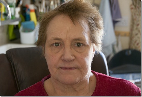
This image was taken in Viv’s studio with the only light coming from the window (behind me) and the patio doors (behind Viv). ISO 200, f/4.8, 1/15 sec. I increased the exposure by 1.5 stops in Lightroom 4 then converted it to tiff for further work in Photoshop 5.1

Exercise 4.03 01

I selected her face using Topaz Remask 3 with refinements in Photoshop using a layer mask.. In this selection I increased the brightness to 53 and contrast to 7 – any further increase in contrast was detrimental, showing more smile lines.

Exercise 4.03 02

The next selection was of the irises of her eyes. This was done using the magnetic selection tool. I increased the saturation by 36 and the brightness by 20 to give the following image. With any further increase in saturation, the eyes became unnaturally vivid.

Exercise 4.03 03

As this stage has lightened her natural eye colouring, I feel that I’ve moved from enhancement to alteration. Maybe it’s because the eye colour is such a major part of a person’s makeup – I think more than the skin tone, as this changes through the seasons, whereas the eyes are constant.

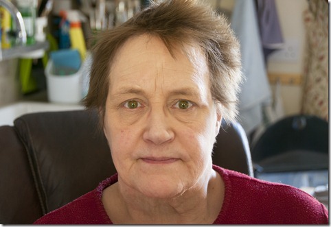
Finally I changed her eye colour, using the same selection as that for the saturation / brightness, I increased the hue by 151, decreased the saturation by 40 and increased the lightness by 8. I then increased the contrast by 19, to bring back some definition between the irises and pupils.

Exercise 4.03 04

I was pleased with the result of the changes, but I think I prefer the green eyes I’m used to – so does Viv. The image has now changed so significantly that it’s gone far past enhancement and I’m not comfortable with this amount of change, but that’s probably because I know her so well. If the image were of somebody else and they were happy with a change of eye colour then it would be a different matter.

Monday 23 April 2012

Exercise 4.02 – Improvement or interpretation

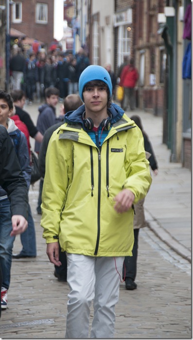
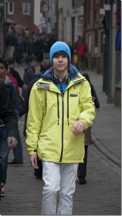
My source image was taken in the old part of town where a group of visiting students were happy to pose for me. This young man’s confidence and presence worked well for both of us.

Exercise 4.02 01

I duplicated the background layer and used Topaz Remask 3 to select him from the main image, then a layer mask to make the final retouching to the selection.

I then used an exposure adjustment layer, above the original background layer, to decrease the exposure by two stops, giving this result:

Exercise 4.02 02

The young man is now significantly exaggerated in the image. I felt there was no need to enhance the selected area, as the contrast between the foreground and background worked as it was. This is closer to the dodging and burning I practiced in the dark room, where the selection would have been covered by a mask while the rest would have continued being exposed.

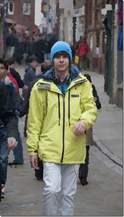
Hiding the exposure adjustment layer, I then treated the background copy with Gaussian Blur (radius 48.6 pixels), to produce this image:

Exercise 4.02 03

In this case, the contrast is between the sharpness and blurred areas. I prefer this treatment for this particular image.

Moving further, I applied palette knife filter to the background layer and made the exposure adjustment layer visible, increasing the exposure by one stop, to -1.0. It’s another example of what can be done using the layer mask, or selections.

Exercise 4.02 04

It’s been a fun exercise, but not one I’ve learned much from as these are techniques I’ve used for some time.

Monday 9 April 2012

Exercise 4.01 – Correction

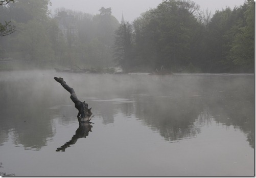
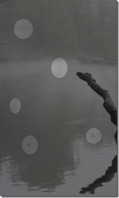
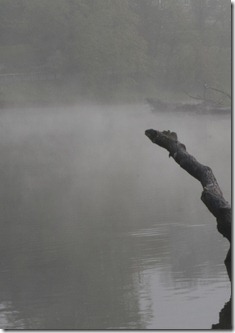
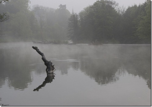
The image chosen for the first part of this exercise was taken early in the morning before the mist cleared on the river – even too early for the waterfowl to arrive. This image had a relatively long exposure (1/20 sec) which makes it more likely to show up marks on the sensor.

Exercise 4.01 01.0

Looking more closely there are several marks on the sensor:

Exercise 4.01 01.1

At this time of day, the last consideration is a dirty sensor. I’d have to admit to poor maintenance here. This was taken with a Nikon D200. The D300s has automatic sensor cleaning which has reduced the problem considerably.

Exercise 4.01 01.3

These were easily removed, using the spot healing tool in Photoshop CS5.1

With the ‘content aware’ selected, the correction is simple and undetectable.

Personally, I don’t have a problem with this type of correction.

Exercise 4.01 01.2

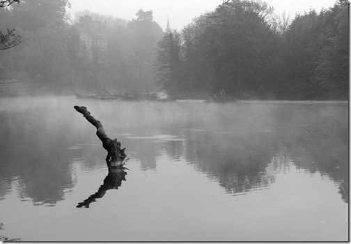
The corrected view looks as it should, without the imperfections of the original image. I think it looks better in monochrome:

Exercise 4.01 01.4

Using the supplied image, I’ve again used the spot healing brush, and also the clone tool, to remove what I believe to be imperfections due to dust on the sensor. I may have removed some of the natural blemishes in the subject, but I think the judgment call is reasonable, as I’ve left any coloured marks, rather than the grey / black marks usually attributed to dust.

Exercise 4.01 02.1  Exercise 4.01 02.2

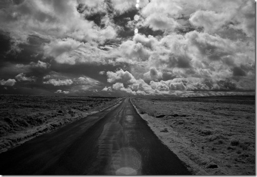
The second image from my collection has lens flare:

Exercise 4.01 03.1

This was an experiment using a Nikon D70, with the sensor screen converted for infrared photography – I wanted to see if the lens flare was apparent in infrared – it was!

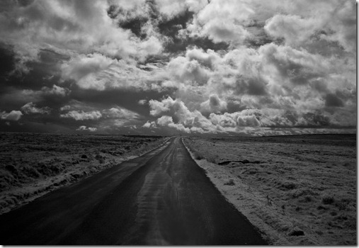
To remove the lens flare I used the spot healing brush, the clone tool and the burning tool.

Exercise 4.01 03.2

I know the corrected image is not exactly as the scene when I took the image, but in this case I’m quite happy with the result, as it’s an ‘art’ image rather than a documentary type, so an exact replica of the scene is not required. The original flare lines look quite good too, so their removal could be called into question anyway.

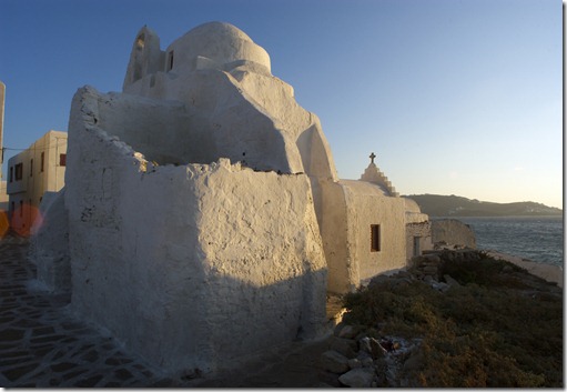
Using the supplied image for flare was more difficult, as I assumed that a reasonably accurate interpretation was required:

Exercise 4.01 04.1

For this correction I had to almost reconstruct the buildings in the area of the flaring, using the clone tool. I also selected the flare polygon area and used ‘selective colour’ and ‘replace colour’ adjustments to reduce the impact of the red and yellow in this part of the image.

I also used the spot removal tool, to remove what I perceived to be extensions of the flare line in the sky above the headland.

Exercise 4.01 04.2

The reconstruction involved virtually rebuilding the windows so obviously there will be some difference to what was originally seen in the view, so obviously there may be concerns here if it were to be a record image. I’ve shown what can be done to correct the flare and personally I’d be happy with it if it was my image, but other viewers may have concerns.

I was shown, over 40 years ago how different skies could be masked onto clear ones in landscape photographs in the darkroom, to produce a more pleasing image and it was old technology then. So nothing has changed here with digital imagery – it’s just got easier and better. Whether it’s ethical or not depends on the purpose of the image – I prefer to consider myself more of an artist!

Project - Digital photography and 'truth'

Part 4 - Reality and intervention